Telecom

MTN

Seamless mobile app and website user interface redesign.

About MTN

MTN Nigeria is one of Africa’s largest providers of communications services, connecting about approximately 69 million people in communities across the country with each other and the world.

MTN’s vision is to lead the delivery of a bold, new digital world to customers and it’s purpose is to make all Nigerian lives a whole lot BRIGHTER by delivering relevant, accessible, high-quality telecommunications solutions that put them in control.

THE PROBLEM
A large chunk of MTN users in Nigeria have been churning from the mobile app due to significant issues with the user interface and this has affected the overall user experience of the app. This is apparent based on the bad rating in both the App store and Play store.
    WHY REDESIGN
    • Fix the poor user interface of both the app and website.
    • Optimize the overall accessibility of the app and website in line with WCAG 2.1
    • Implement a seamless easy to use interface and experience.
    LOCATION
    Lagos, (Nigeria)
    COMPANY
    MTN
    MY ROLE
    UI/Visual Designer
    DURATION
    Dec 2022 - Feb 2023

    Intended outcome

      • Decrease in churn rate by 75%
      • Higher customer retention
      • Increase in minutes of usage by 48%
      • Increased conversion rate by 50%
      • Increased downloads from App and Play store by 55%
      • Key KPIs: Success rate, time on task, user error rate, customer satisfaction, net promoter score.

        Some customer reviews (Before)

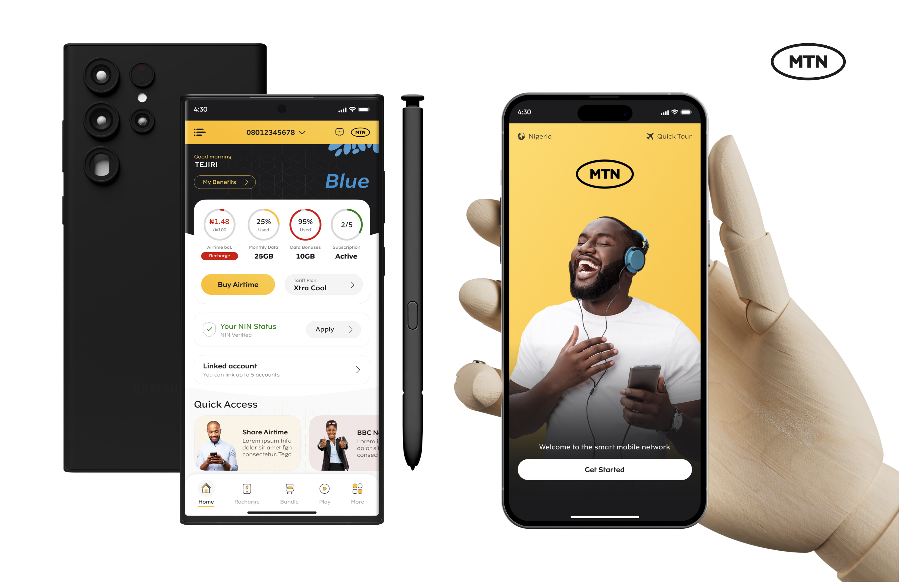
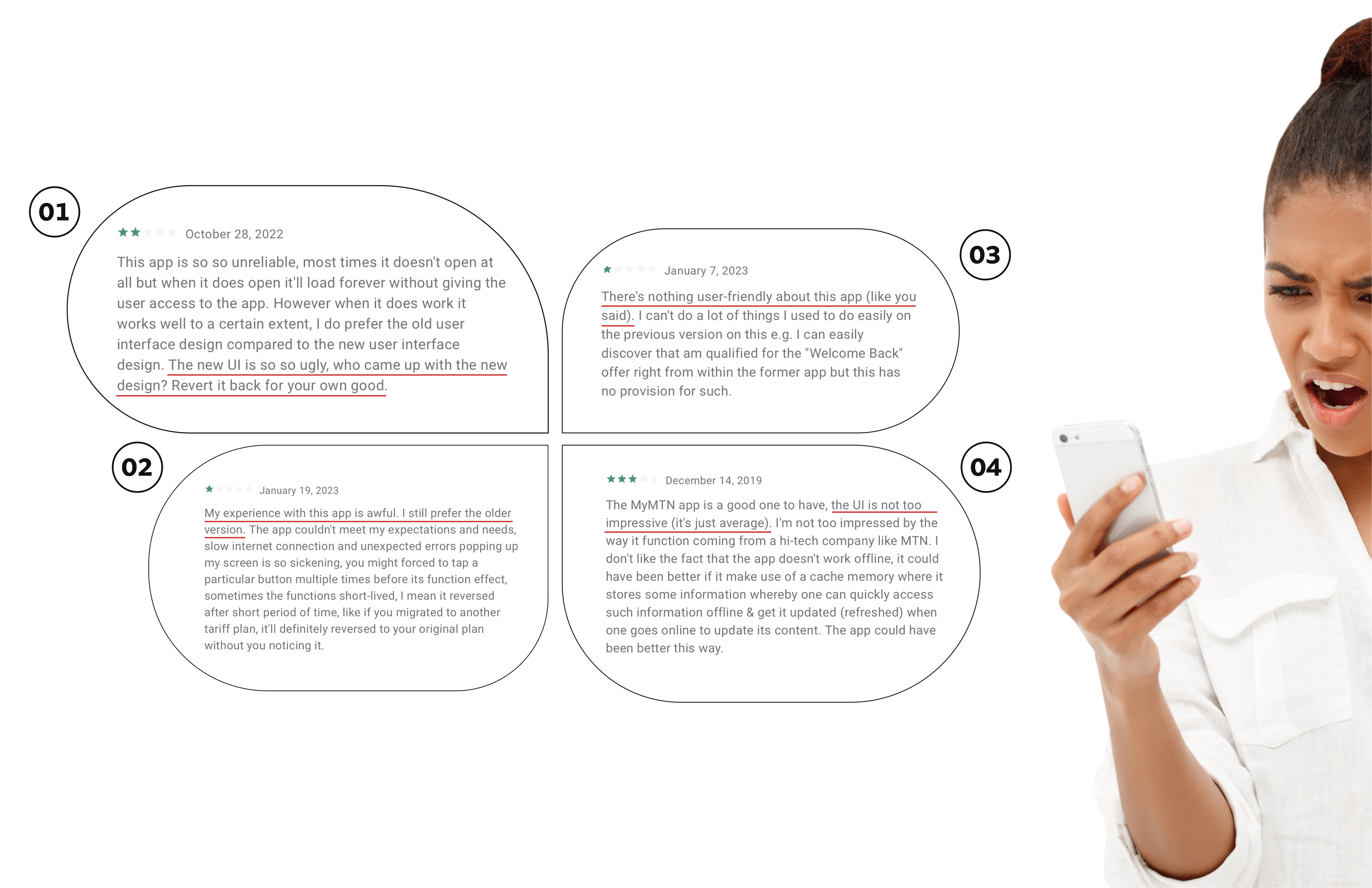
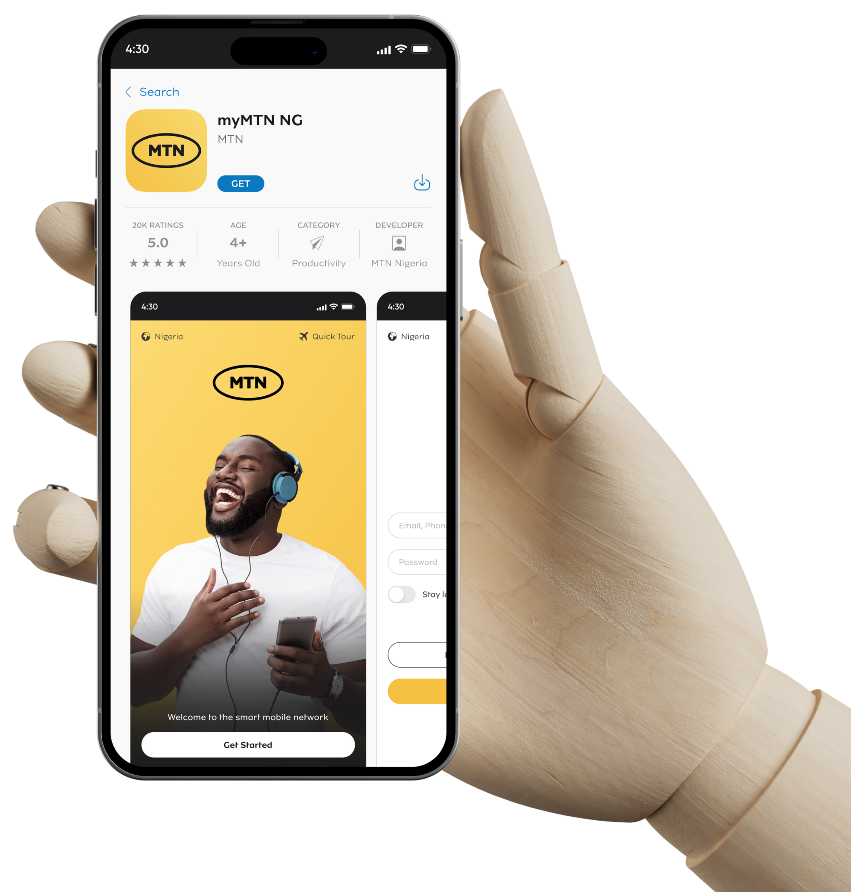
        “The UI is so so ugly, who came up with the design?”

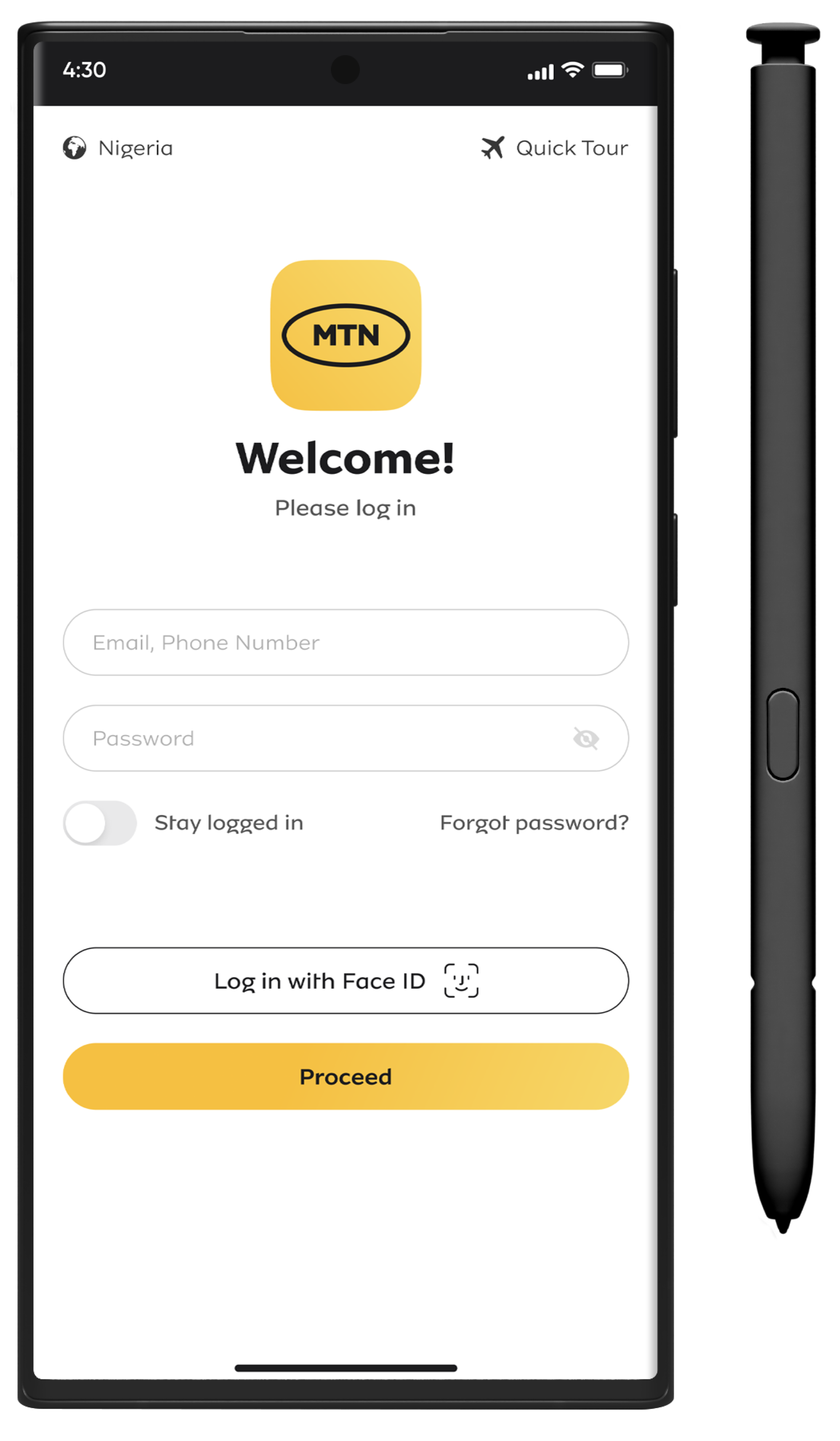
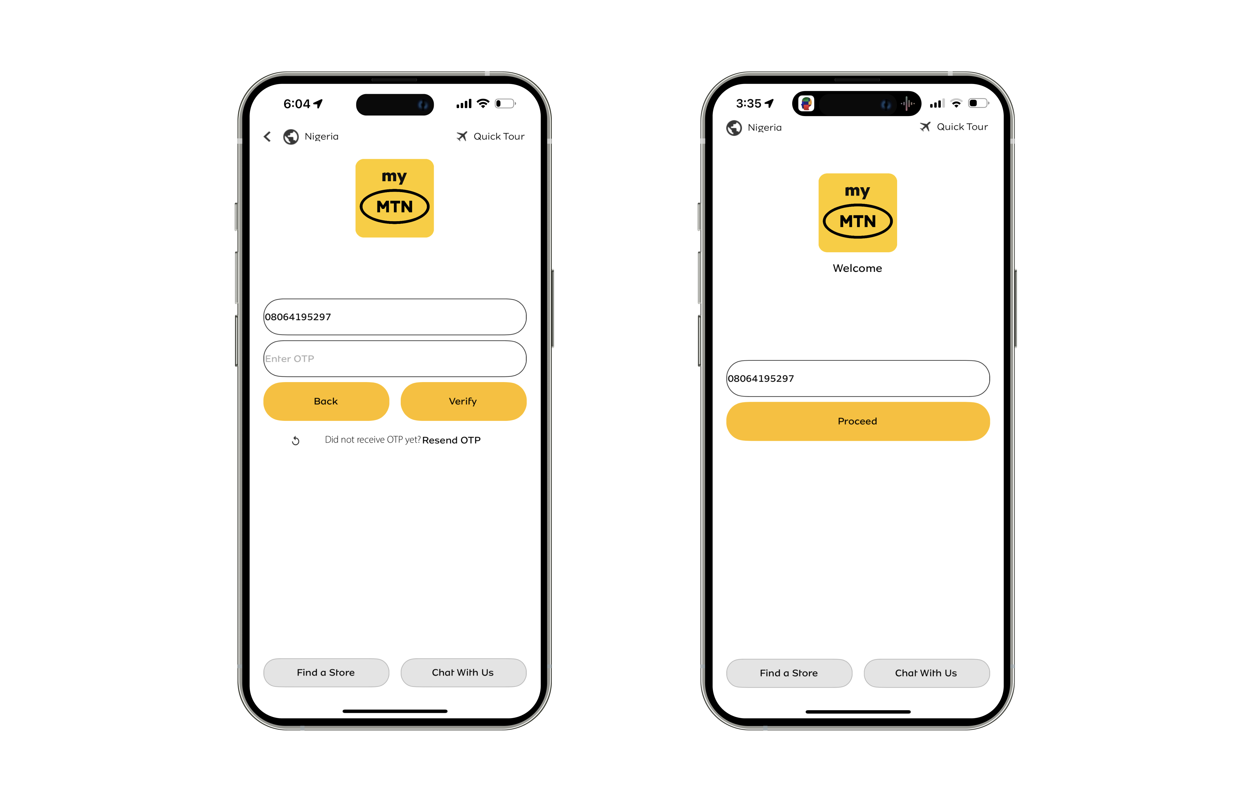
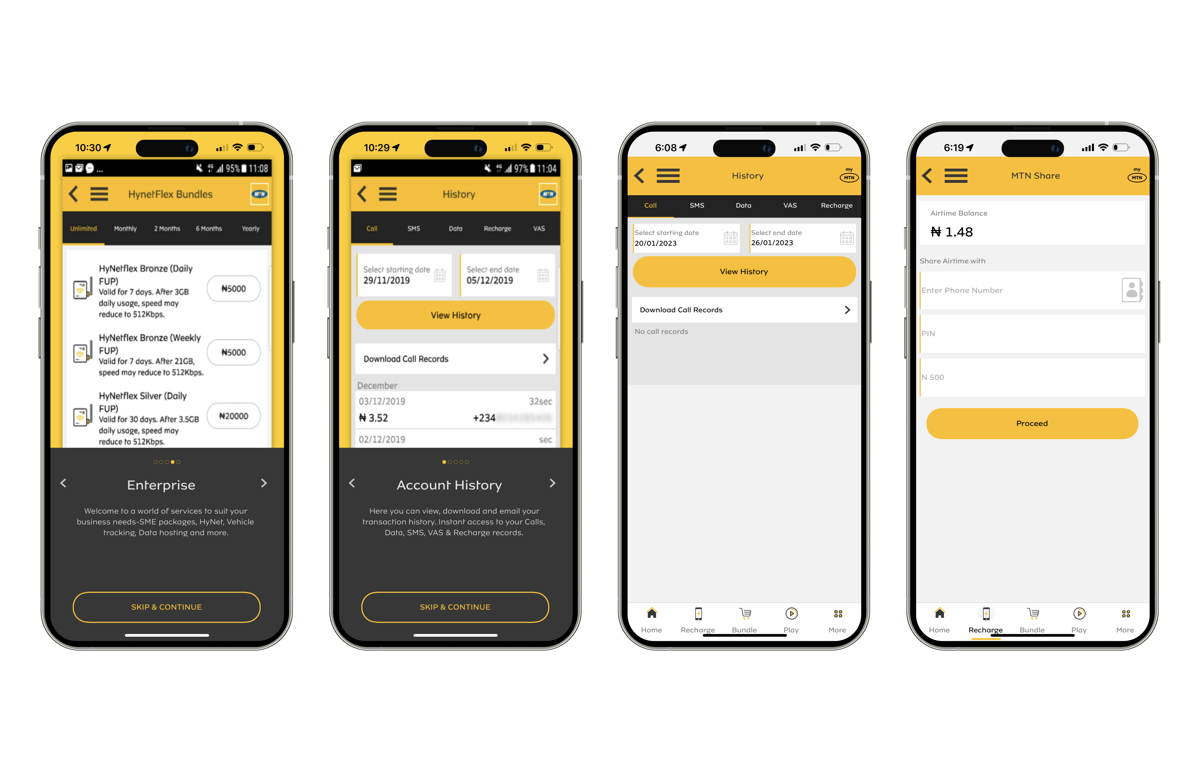
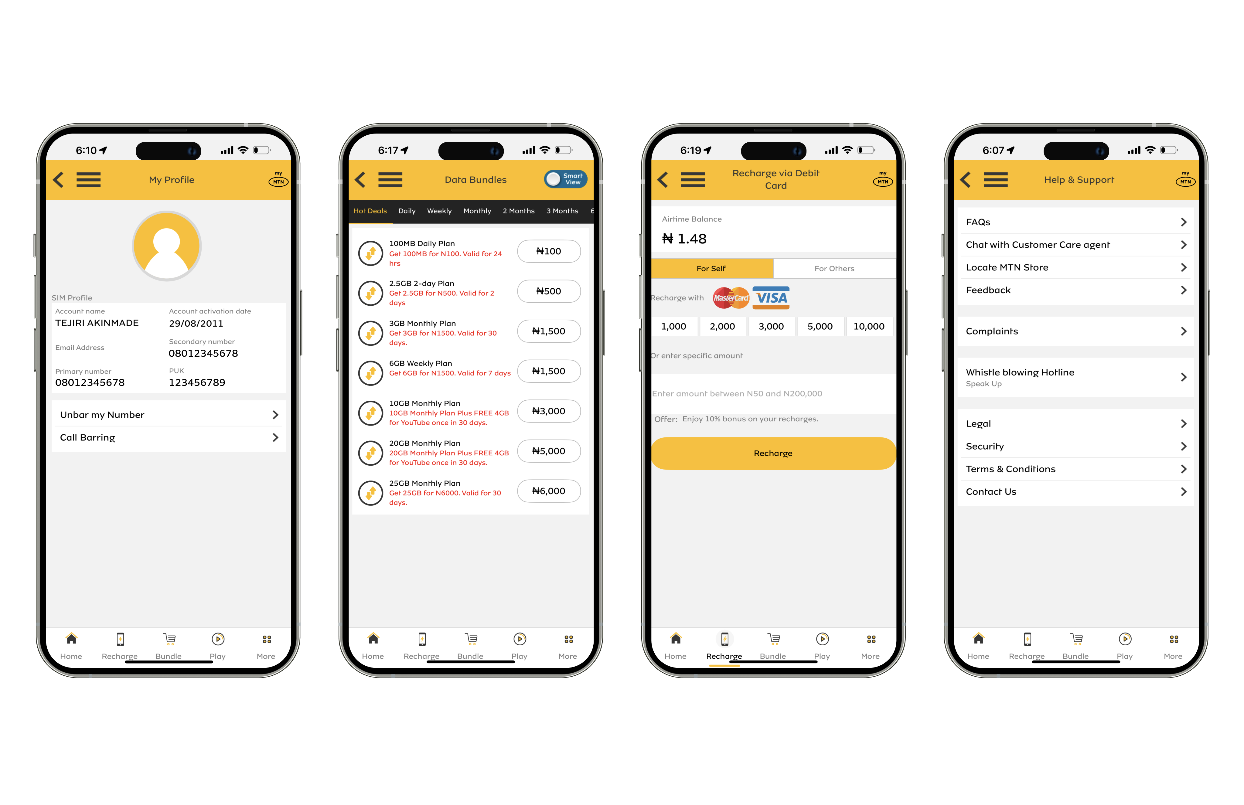
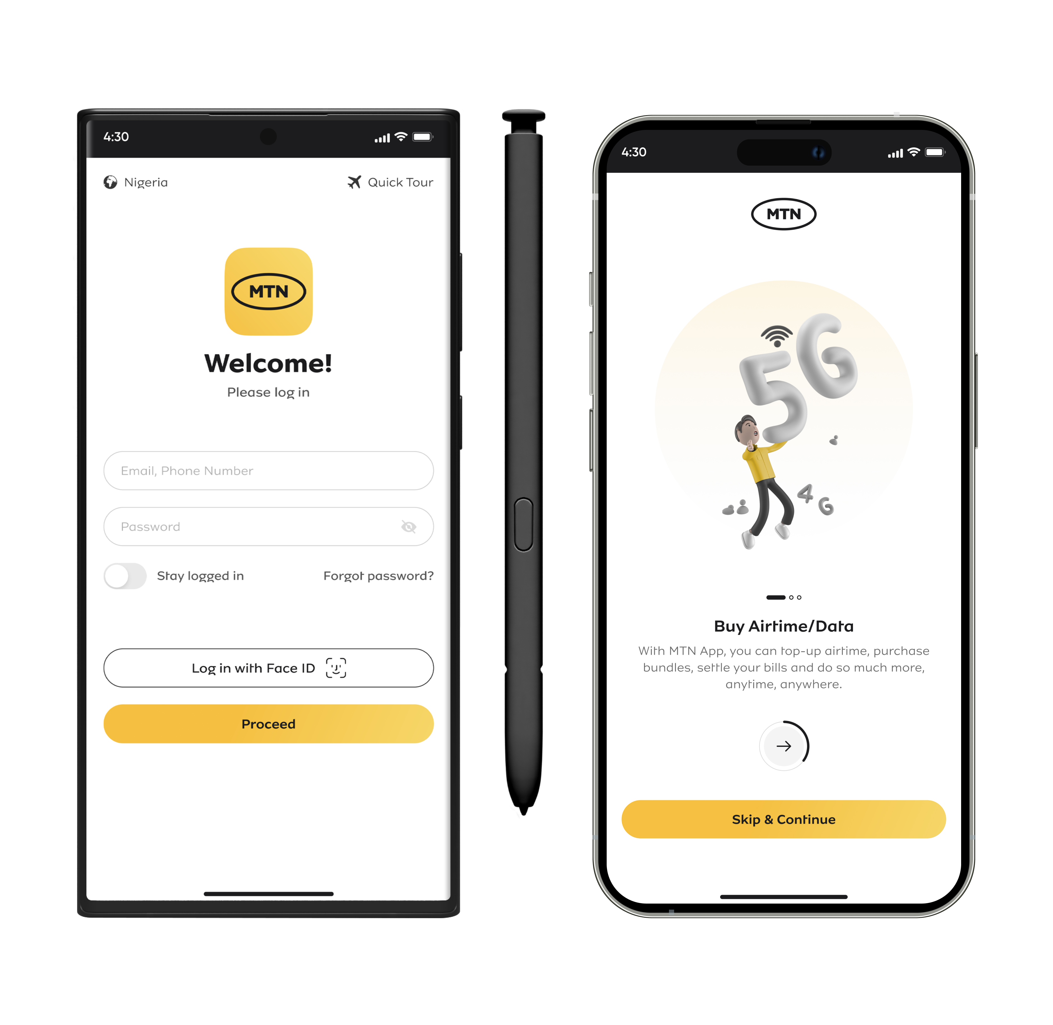
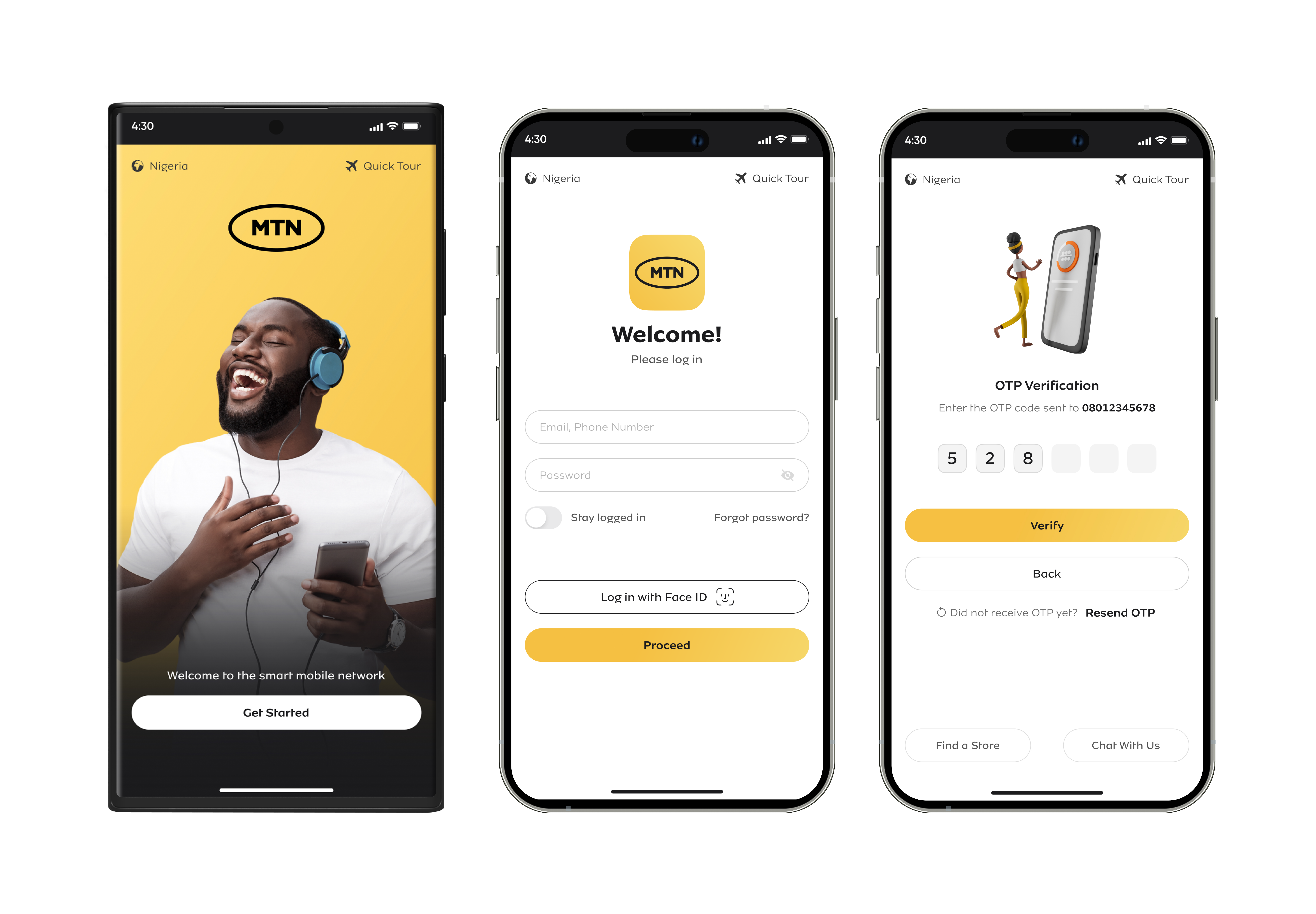
        ANALYZING THE LOG IN SCREENS

        Current UI

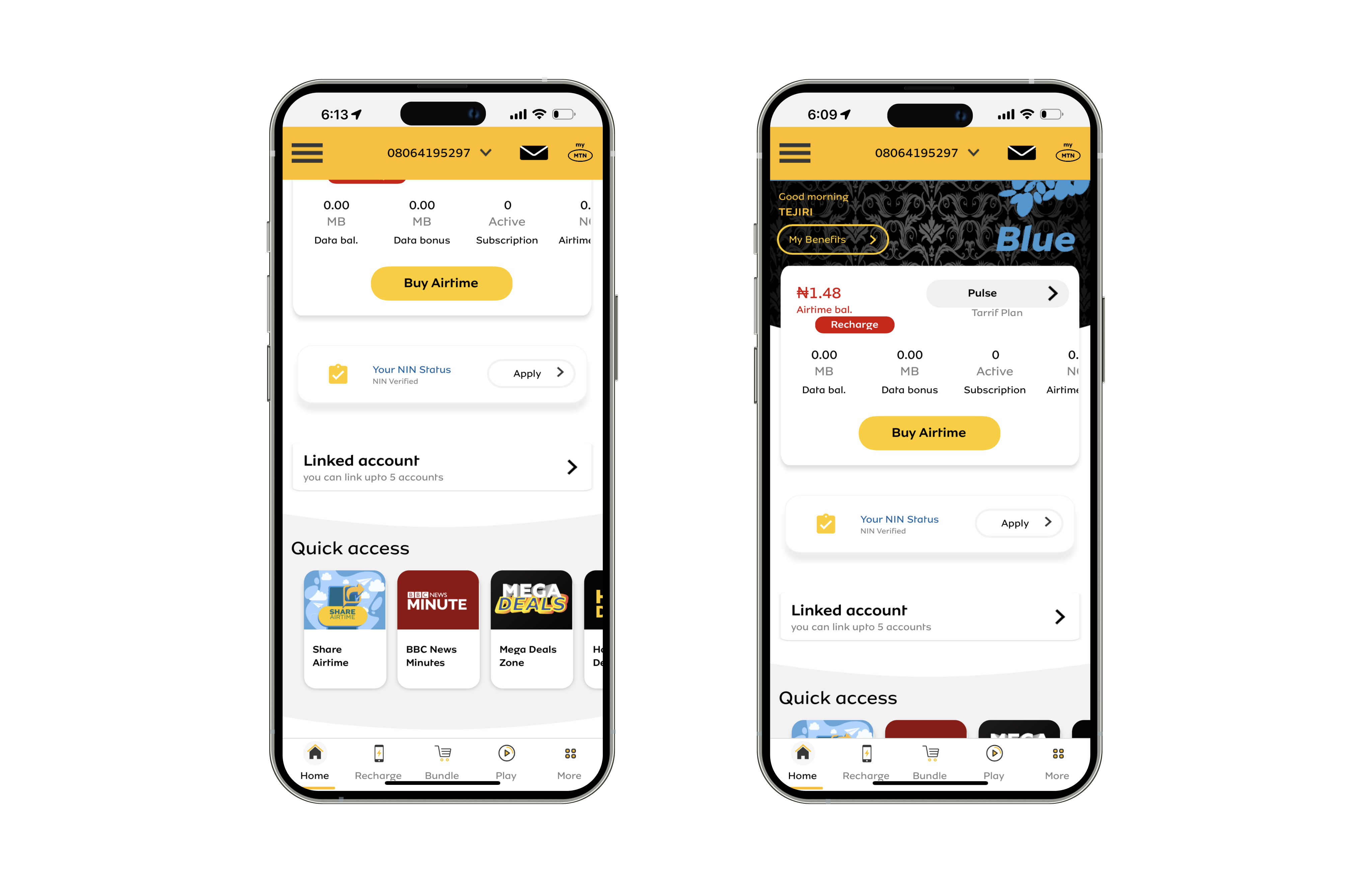
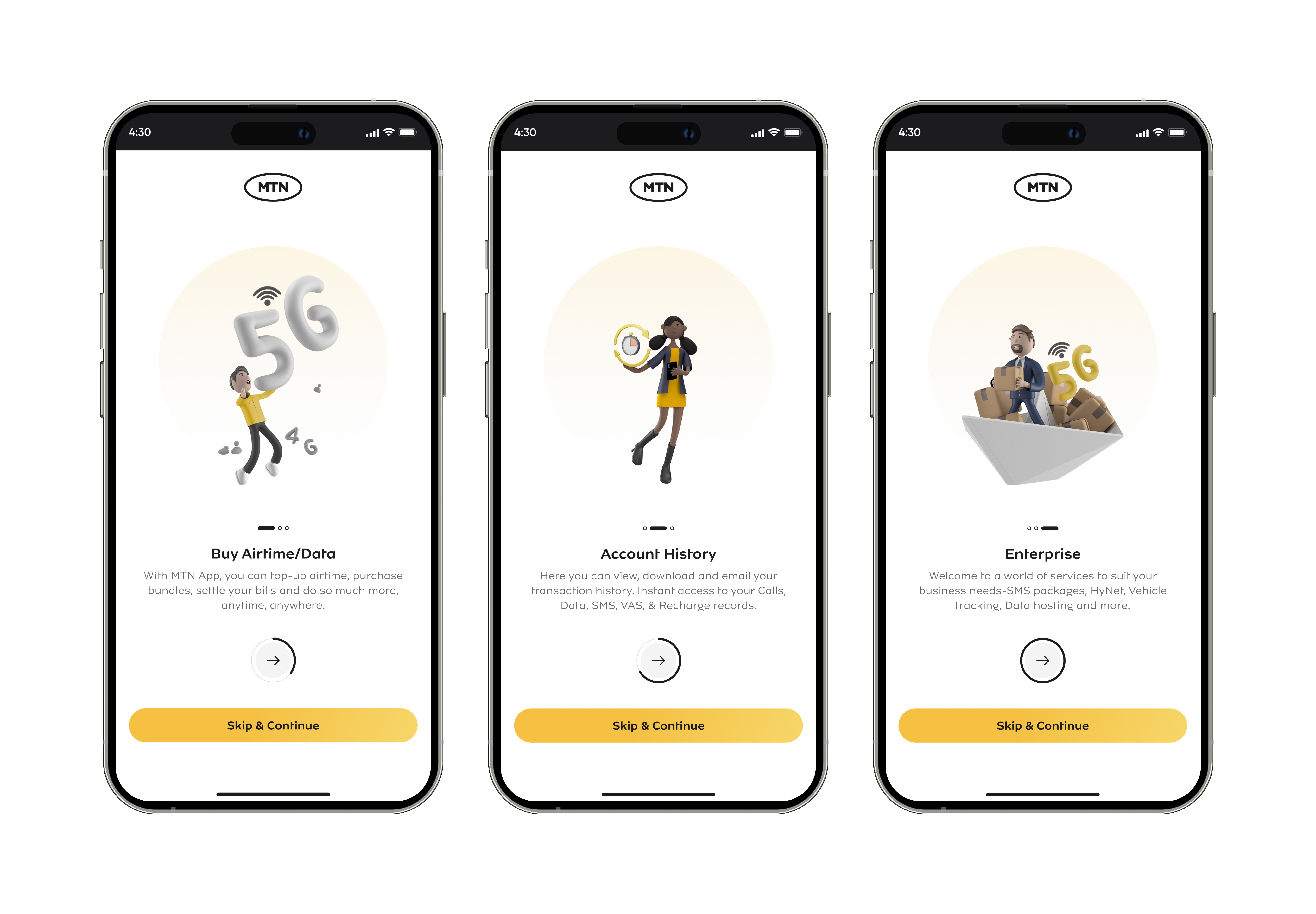
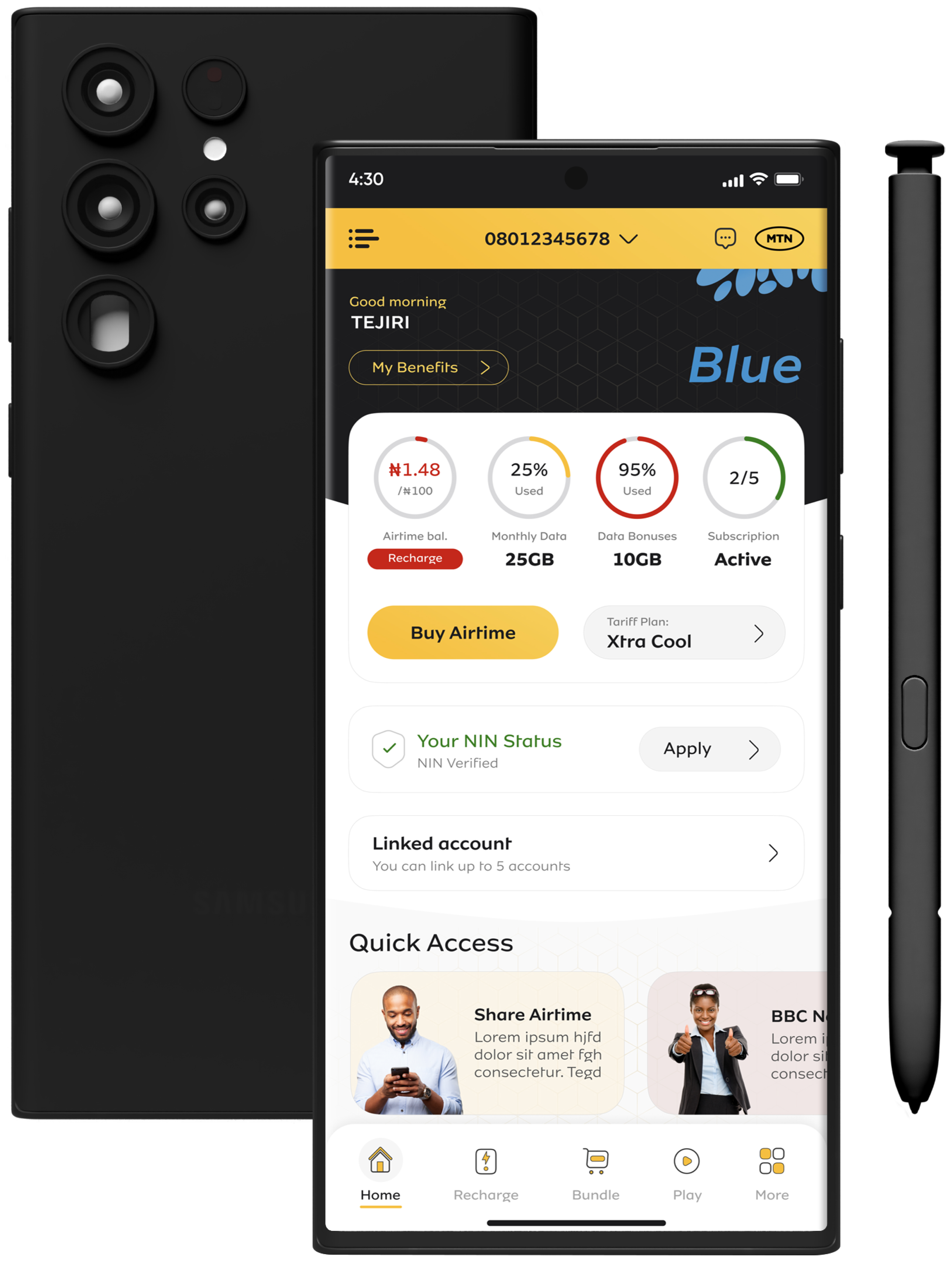
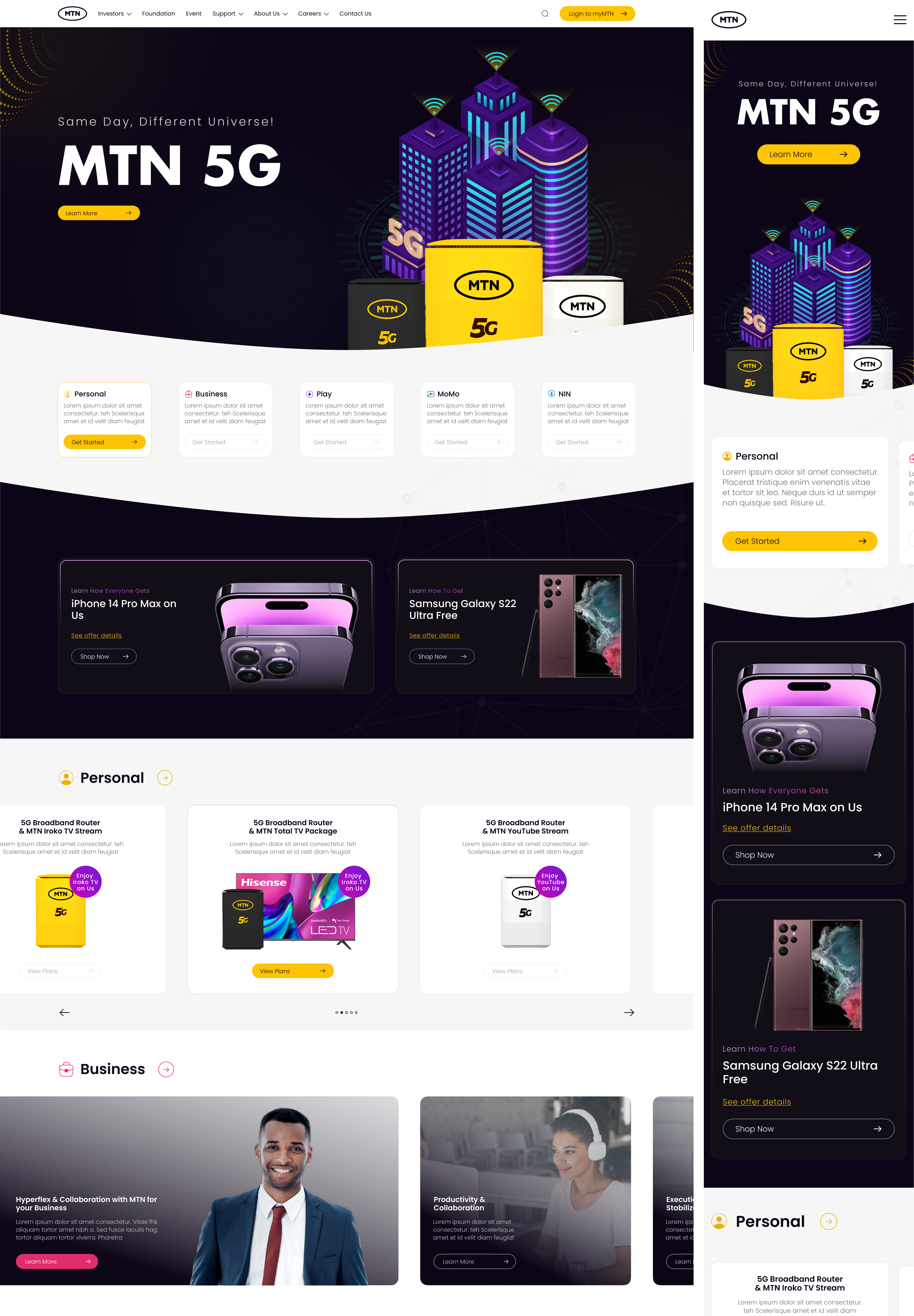
        ANALYZING THE HOME SCREEN
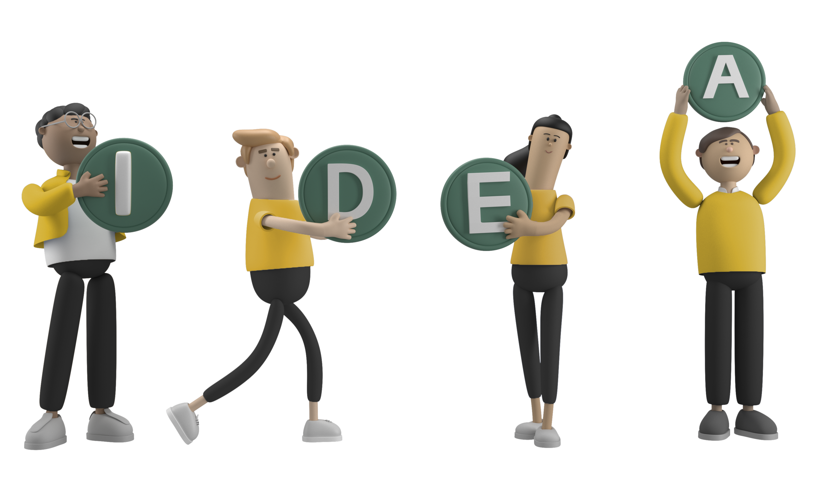
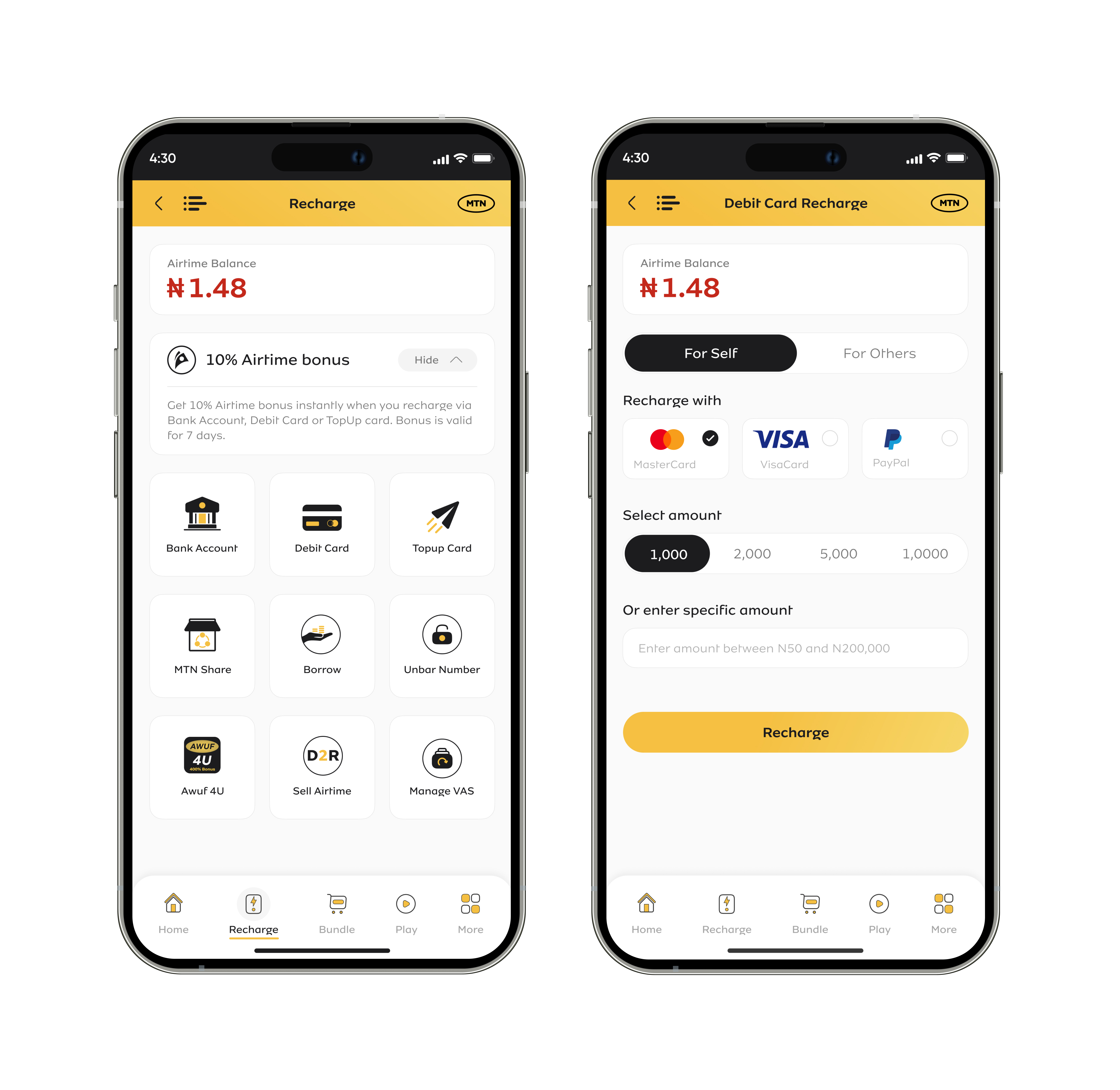
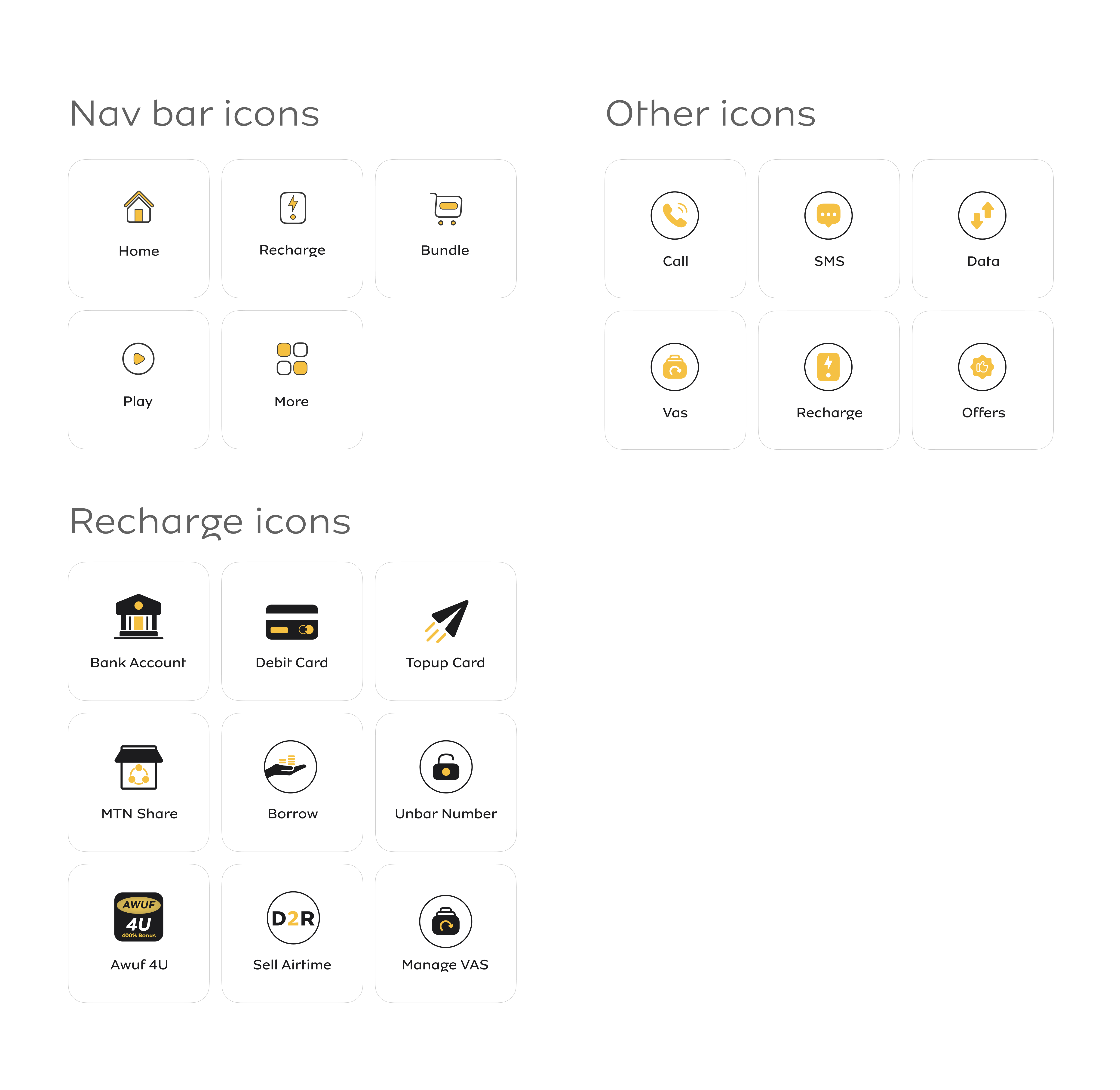
        Current UI

        ANALYZING THE ICONS

        Current UI

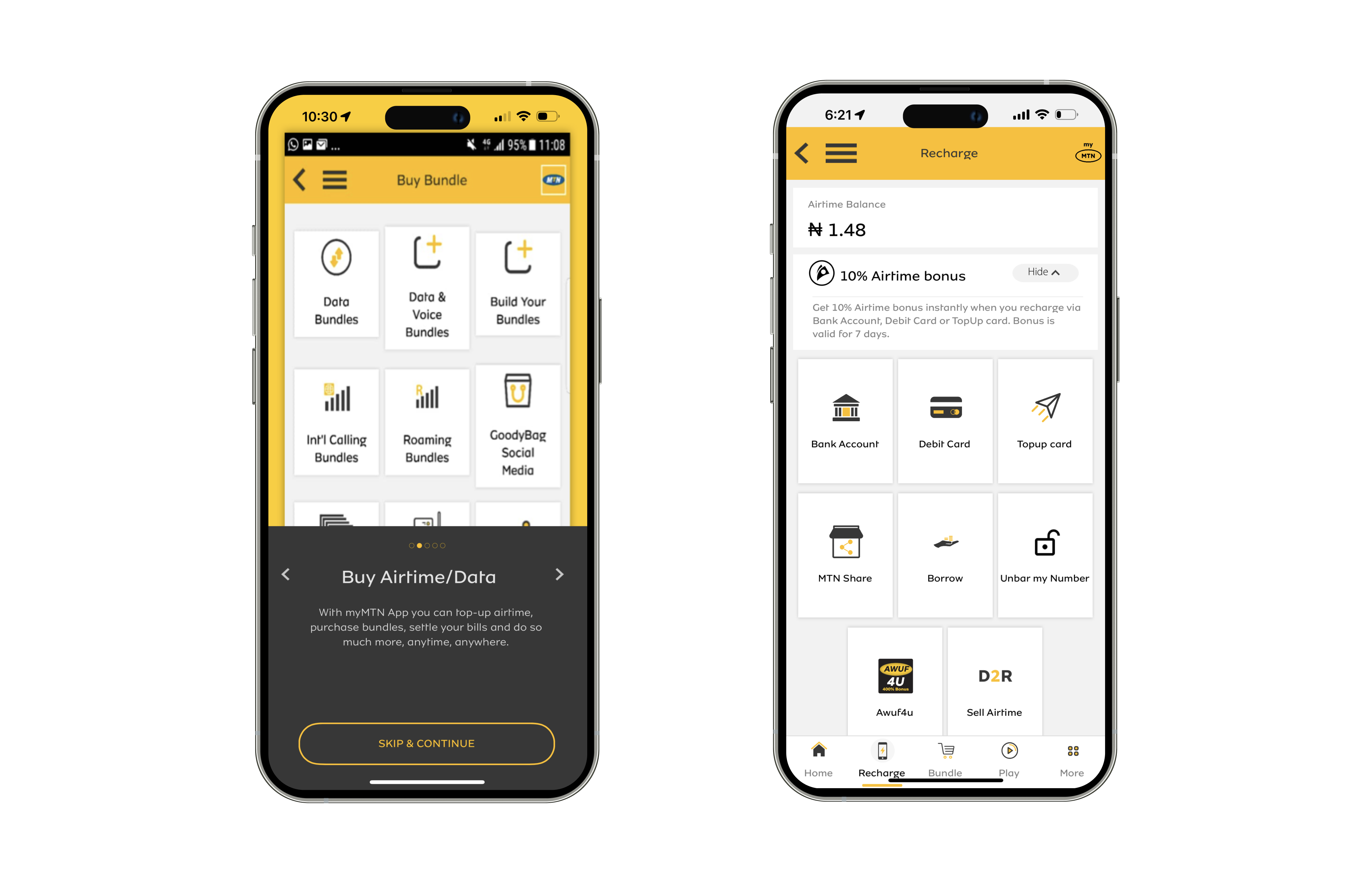
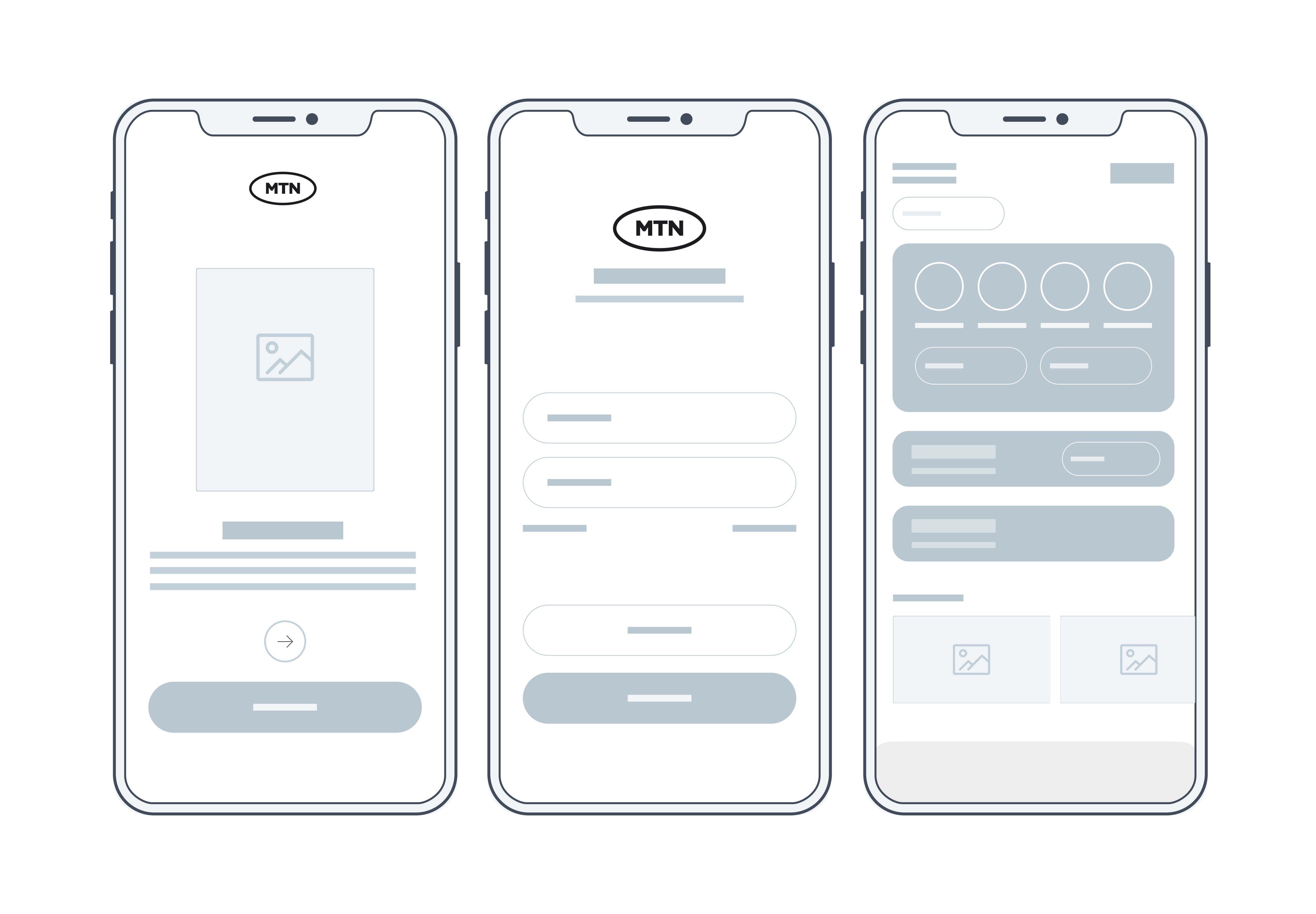
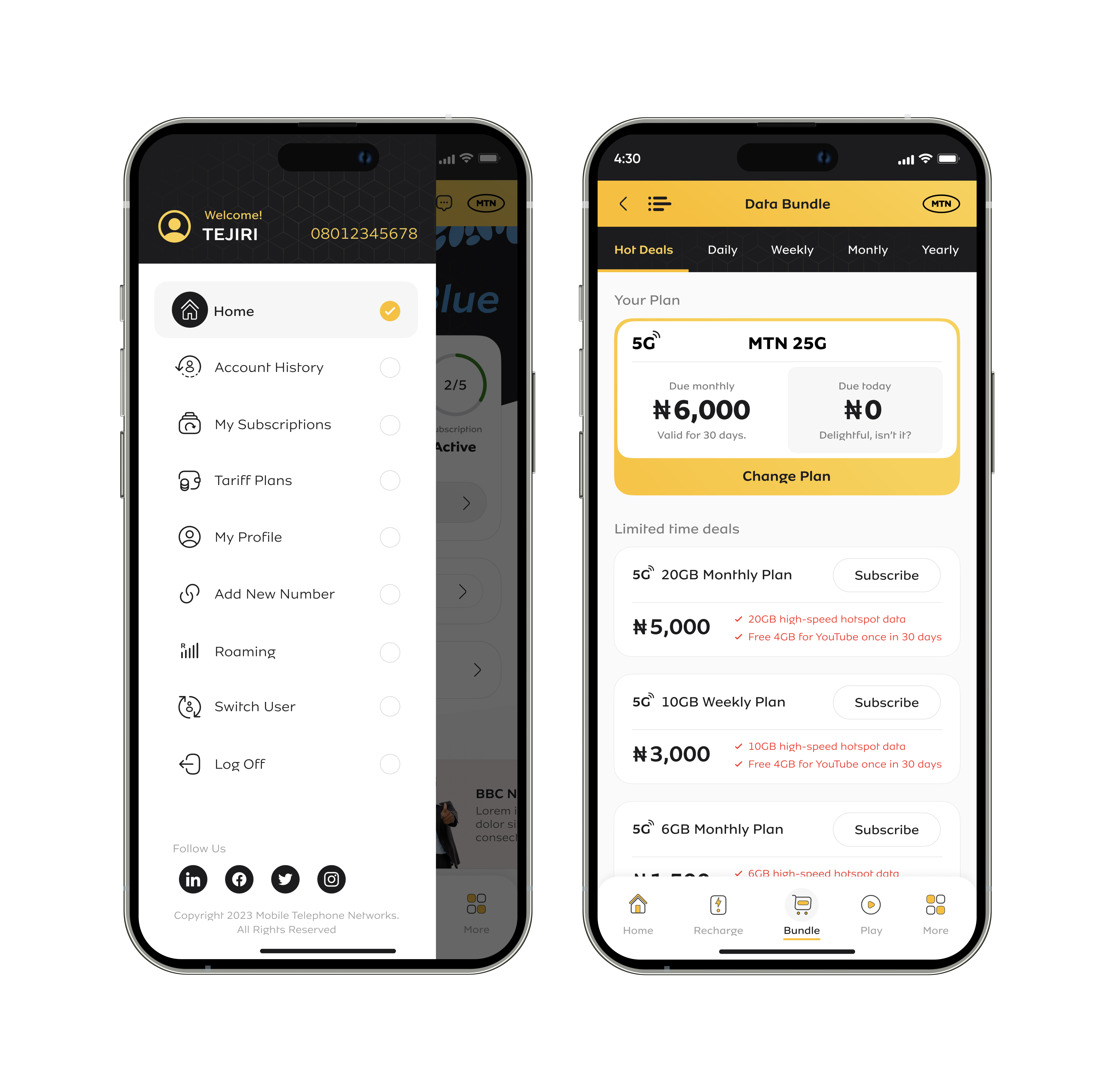
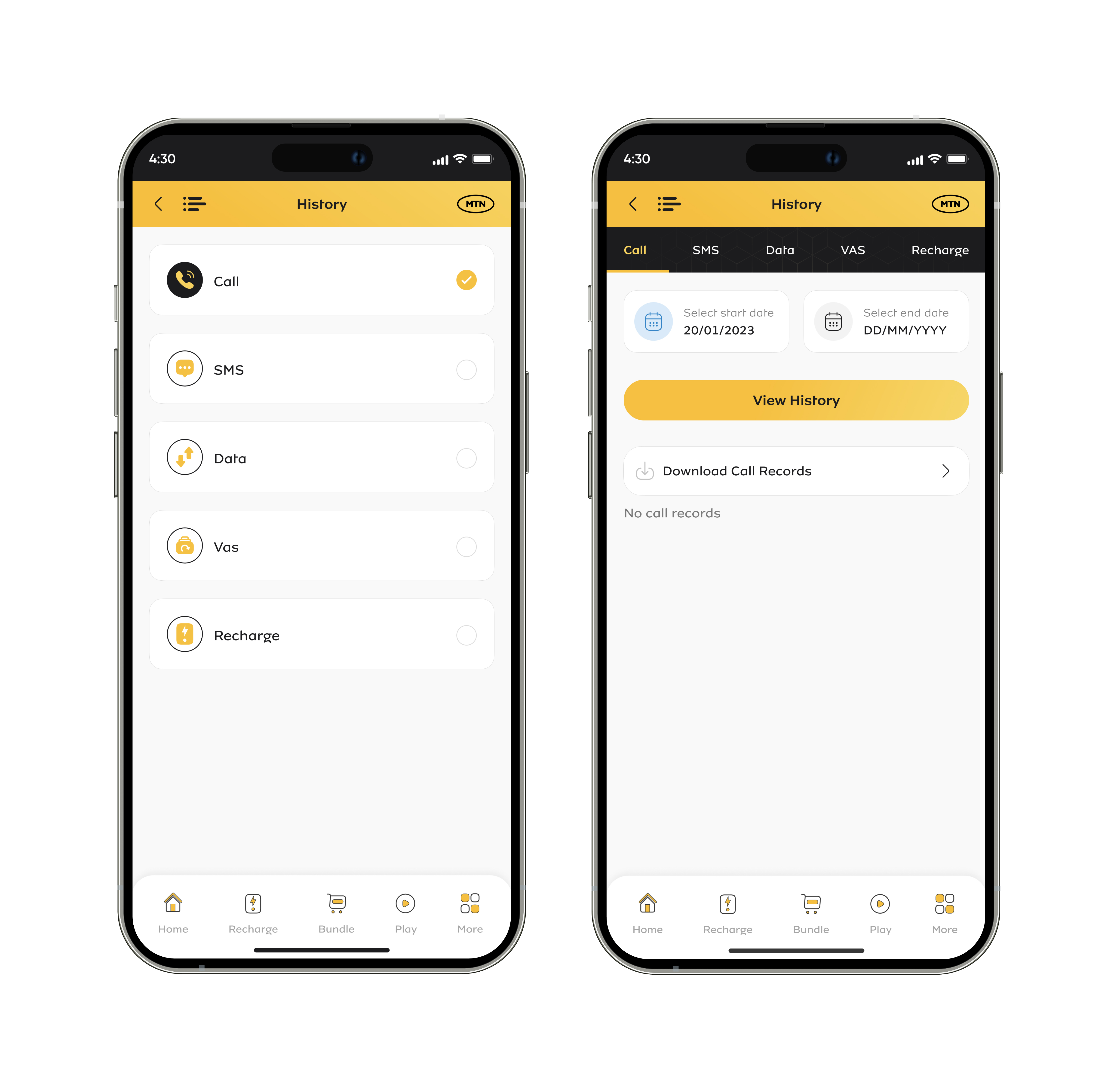
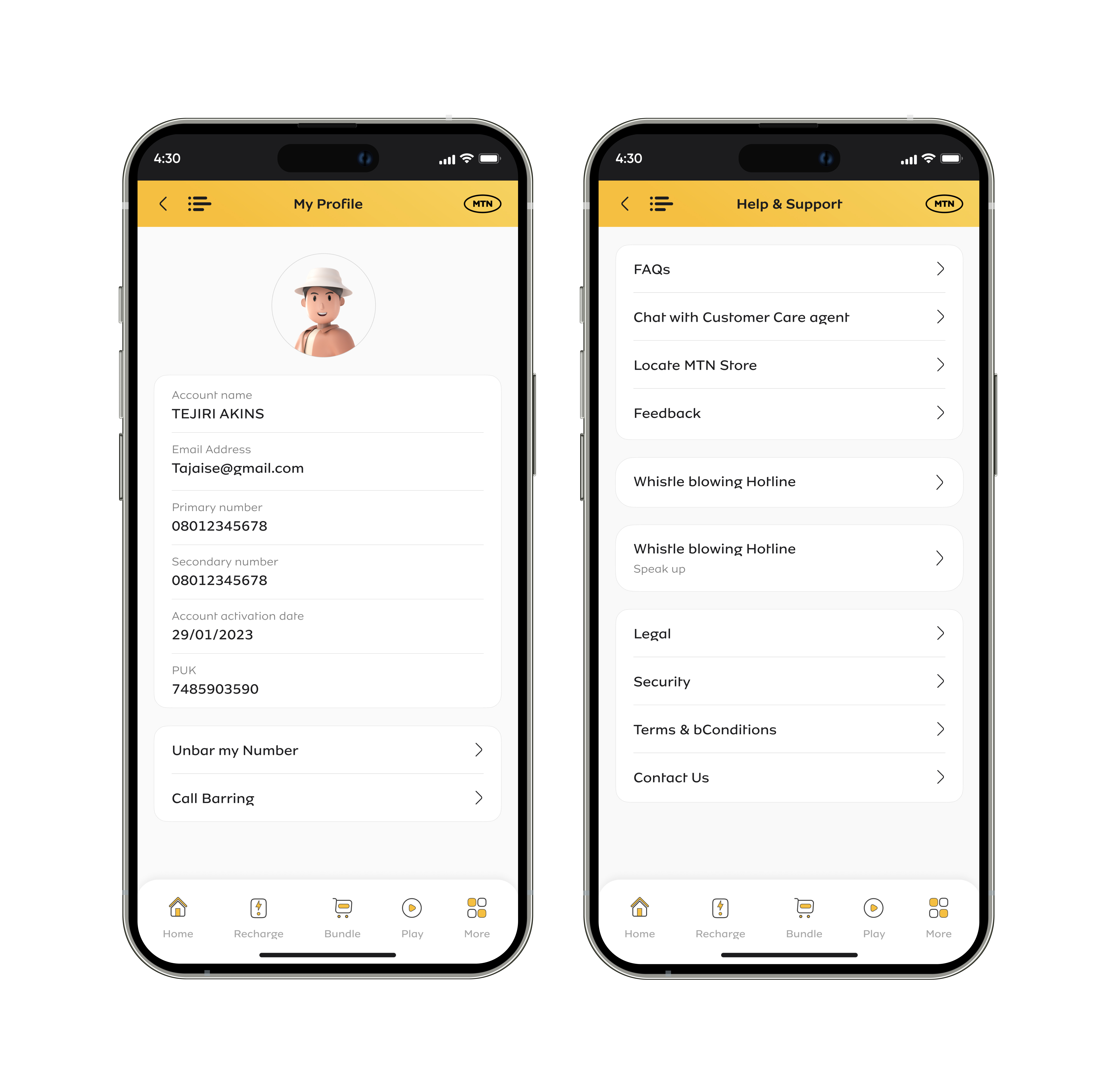
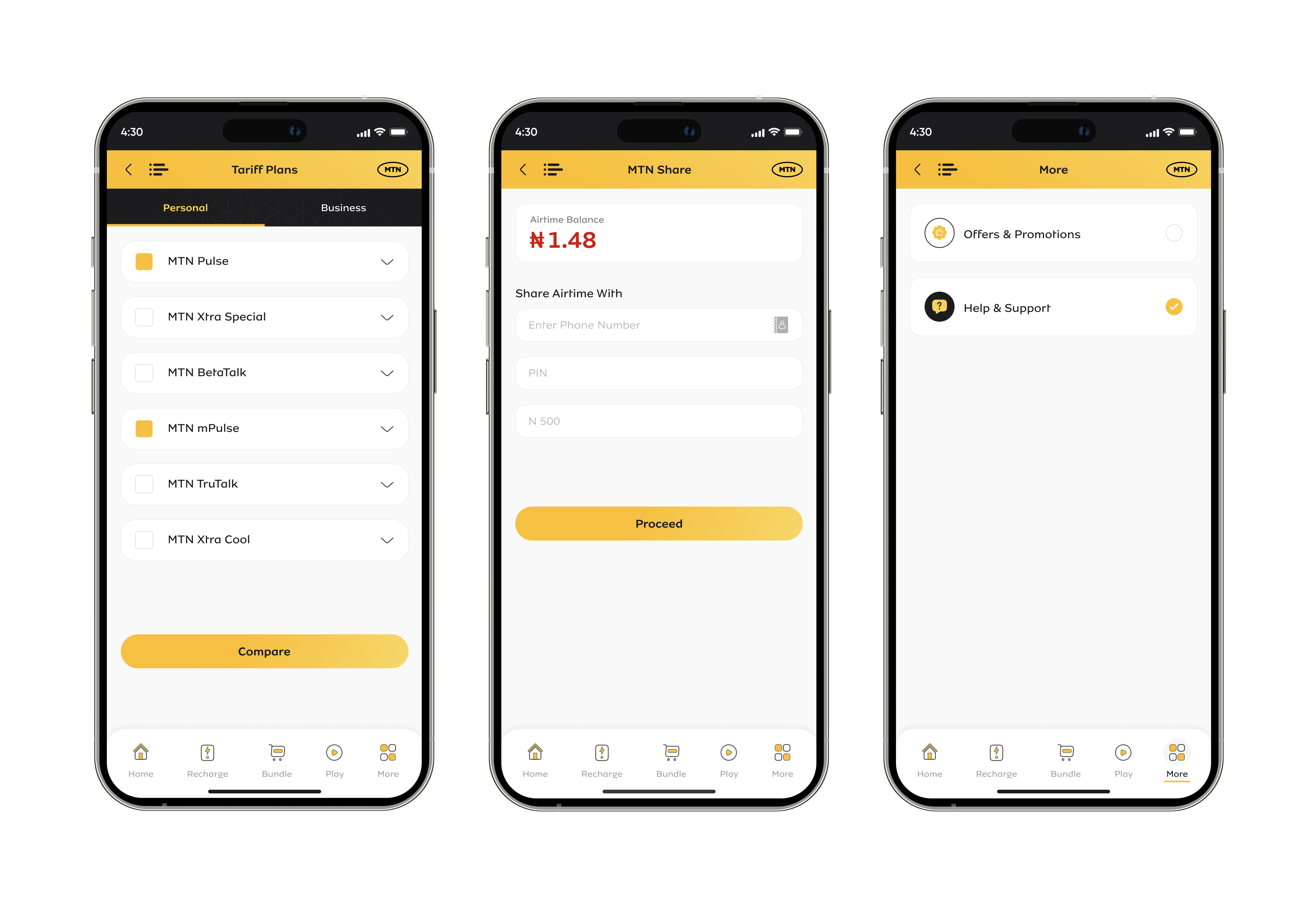
        UI ISSUES WITH OTHER SCREENS

        Current UI

        Key pain points

        • Limited log in options: The only way a customer can log in in the current UI is by phone number.
        • Repetitive task:  OTP is required each time the user tries to log in and this is frustrating for the users.
        • Inability to track call/data usage:  In the current user experience, users are unable to accurately track how much call/data credit they have left.
        • Complex navigation:  Users are required to scroll down in order to get to quick access as well as other significant functionalities.

            Tired of ugly UI?

            KEEP CALM

            This is where Tejiri starts pushing pixels

                A breath of

                Fresh Air

                “everyone deserves a beautiful and usable product”

                  My design strategy

                  How might we?

                  Lo-fi wireframes

                    I created low-fidelity wireframes for most of the major screens based on the solutions from the design exploration phase.

                    The lo-fi wireframes were used as a guide as I transitioned from lo-fis to hi-fis.

                      Onboarding screens

                        Breaking down the designs into tiny bits, making it simple and the addition of customized 3D illustrations brought life into the onboarding screens.

                        Simplicity, carried to an extreme, becomes elegance.

                          Getting started

                            A high quality image was used along with a fine blend of dark gradient in order to captivate the users and add a high level of accessibility to the screen.

                            An option was added for users to log in with Face ID and also decide whether or not to stay logged in. This solves the pain point of requiring users to request for OTP each time they want to log in.

                              Home screen

                                The home screen which is the landing page now clearly shows a proper way to show the airtime balance, usage of data, data allocation and a primary CTA to drive the user to action.  

                                Additionally users can access the most important functionalities without having to scroll down. The overall transformation shows a breath of fresh air indeed.

                                  Recharge

                                    Proper use of white space, refinement and implementation of consistent icons gave these pages a refreshing feel.

                                    All the icons were redesigned in order to achieve a consistent and clean look. The weights and sizes are harmonious as well.

                                      Menu & data bundle

                                        A better visual hierarchy gives the design a better and more refined look. The user can easily identify the data plan and other data plan options. The icons are refreshing and consistent with the overall theme of the design.

                                        Proper use of white space also creates a negative space and gives the end product a more visually appealing look.

                                          History

                                            Appropriate margins, paddings and white space was applied to the refined designs to give it a more polished look.

                                              Profile & help

                                                Simplicity wins most times and this is obvious considering how clean the new designs look.

                                                  Other screens

                                                    With the right use of visual hierarchy, white spaces, margins and paddings, you’re assured of getting a pristine user interface of the product always.

                                                      Icons redesign

                                                        Again! Simplicity, carried to an extreme, becomes elegance.

                                                            App store

                                                            A new pristine look and feel on Apple store.

                                                              Website: Before

                                                              Website: After

                                                              Some more projects
                                                              Next Project
                                                              Tmedics - A holistic telemedicine app
                                                              Previous project
                                                              Shopify - Canada Post bring your own account