Understanding more about the problem space, considering potential solutions and learning about the users and the business goals.
Diving deep into the user journey and exploring user stories, personas and user decision making.
Diverging wide and exploring a range of possible solutions. Testing, iterating, discussing, gaining feedback and working through the problem.
Collecting user feedback through A/B, usability and concept testing to help validate solutions and identify any opportunities for refinement.
Refining a chosen direction and polishing the design in preparing for engineering handoff. Ensuring rationale is clearly documented.
Working closely with engineering and product to ensure a successful handoff. The work isn’t done! We monitor the product’s performance.
I conducted interviews to understand the users I am designing for and their needs. The main target audience for this research was both young and elderly adults who were either incapacitated or were not comfortable with clinic appointments due to the nature of their jobs or the nervousness associated with the clinic environment. Although the initial assumption was that time was the major factor that prevented people from visiting the clinics at the appointed time, other major factors were extracted during the research.
After speaking with several target users about real life expectations and experiences, I created a user journey map based on the user personas to capture the relevant situations and pain points users may encounter.
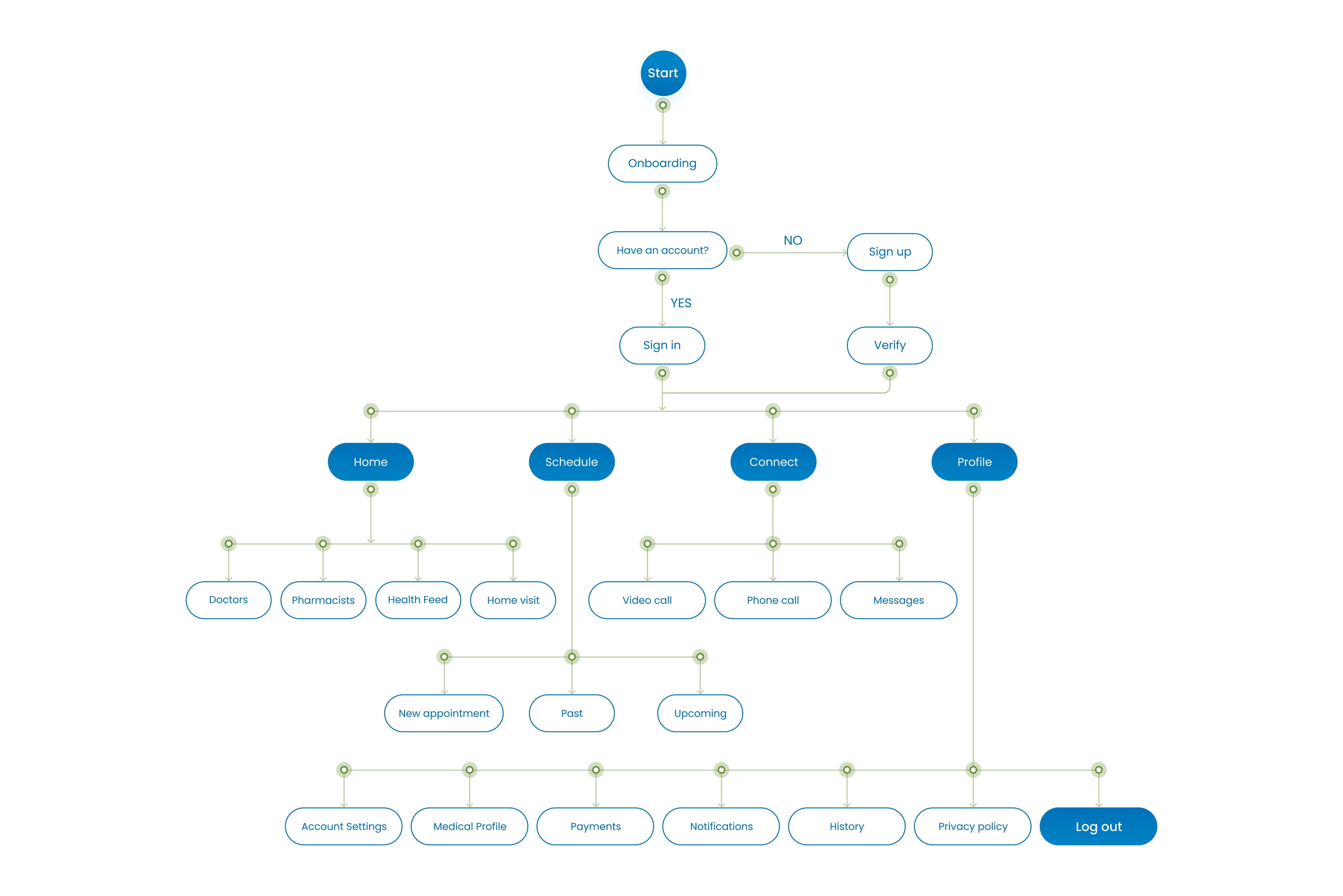
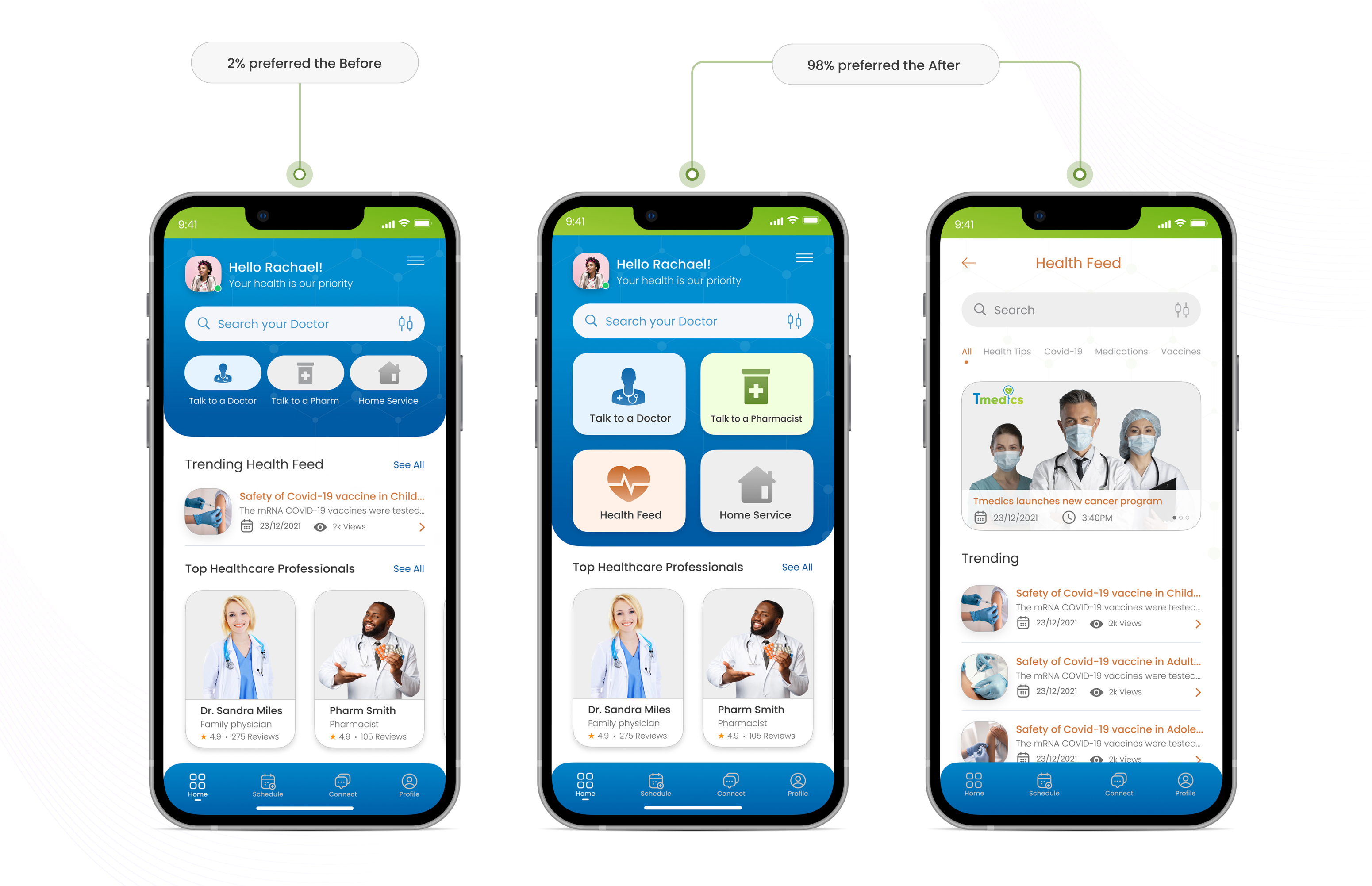
Coming into the design of the app, the easiest design to address the user pain points was the major objective. Several ideas were generated and I drew some rough sketches of how I wanted the basic design to look. I created four major categories for the menu (home, schedule, connect and profile). Three major sections were also included in the home page (Doctors, Pharmacists and home visit). This was modified during the usability study because the goal was to make it as easy and fluid as possible.
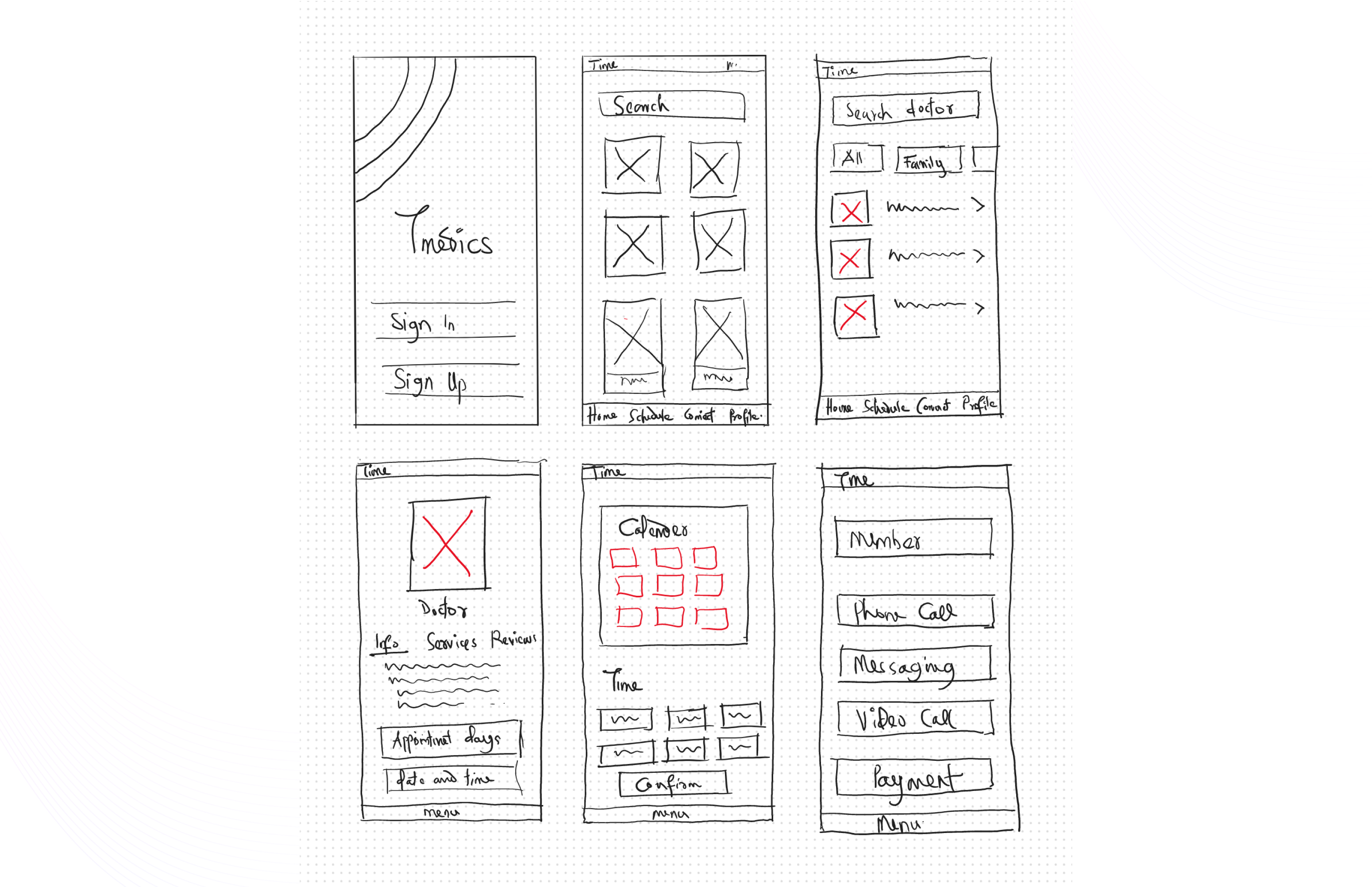
My low fidelity wireframes were designed based on the iteration I got from the ideation phase. Low-Fi wireframes were created in accordance with the need of the users.
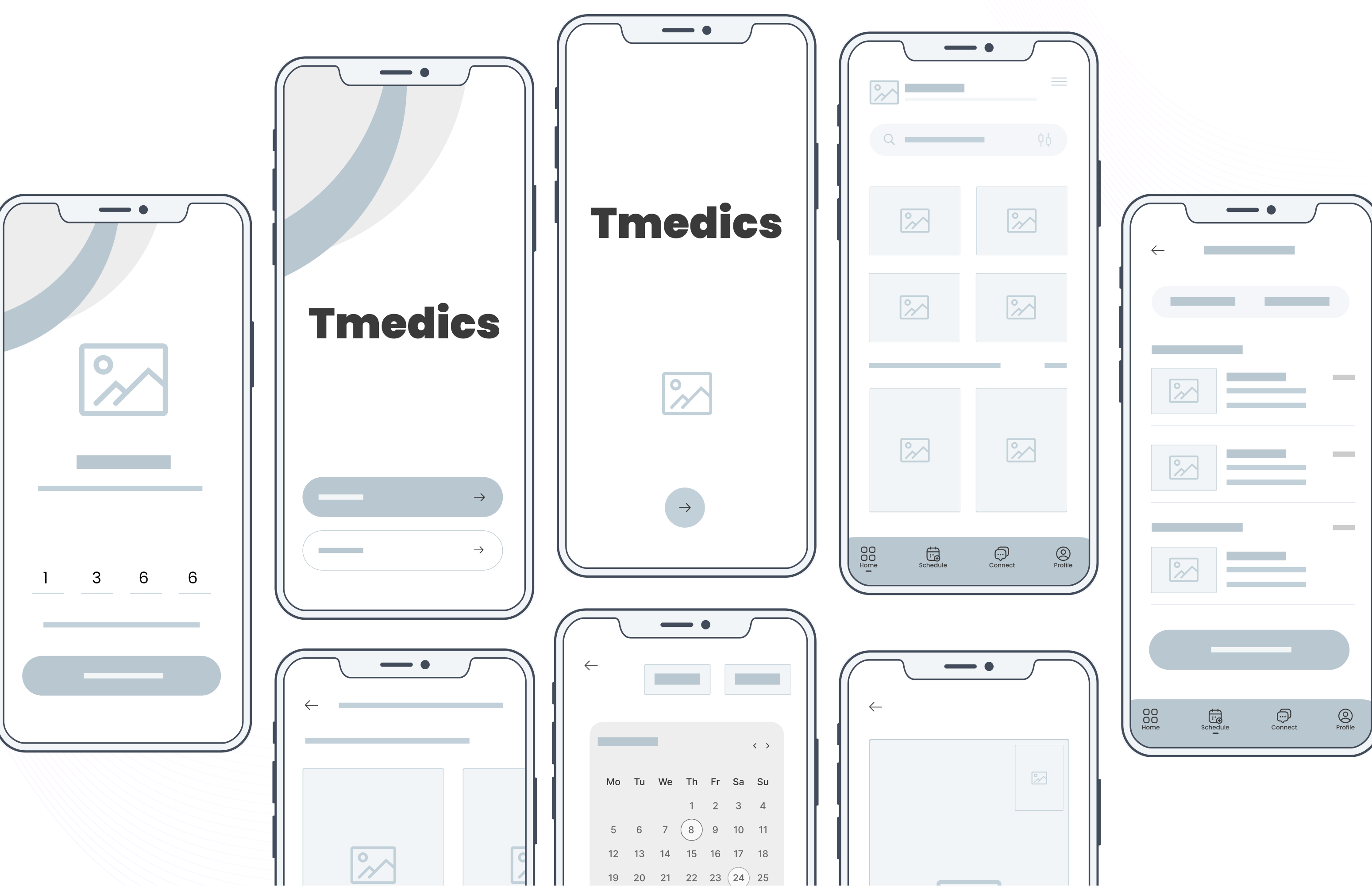
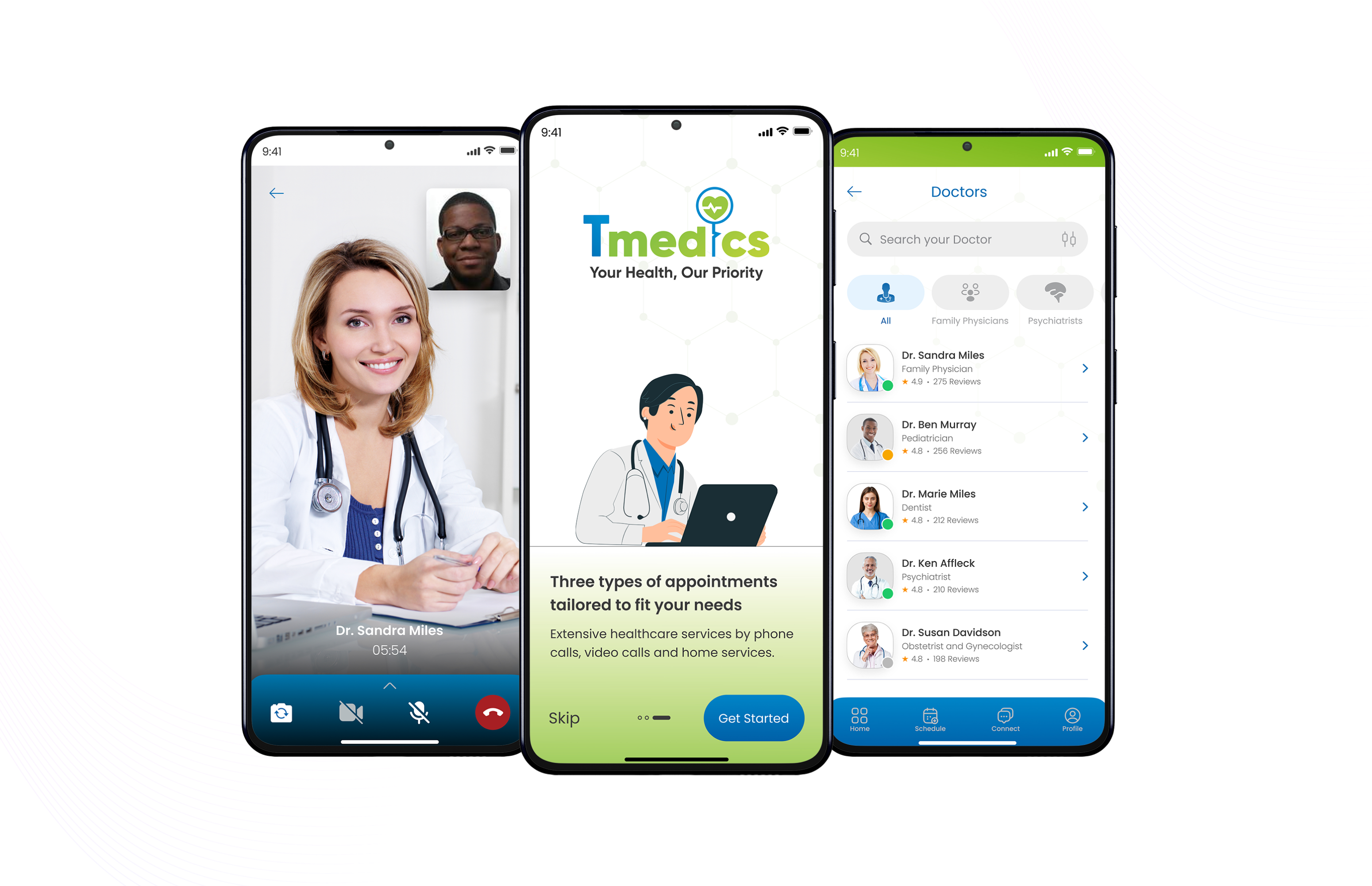
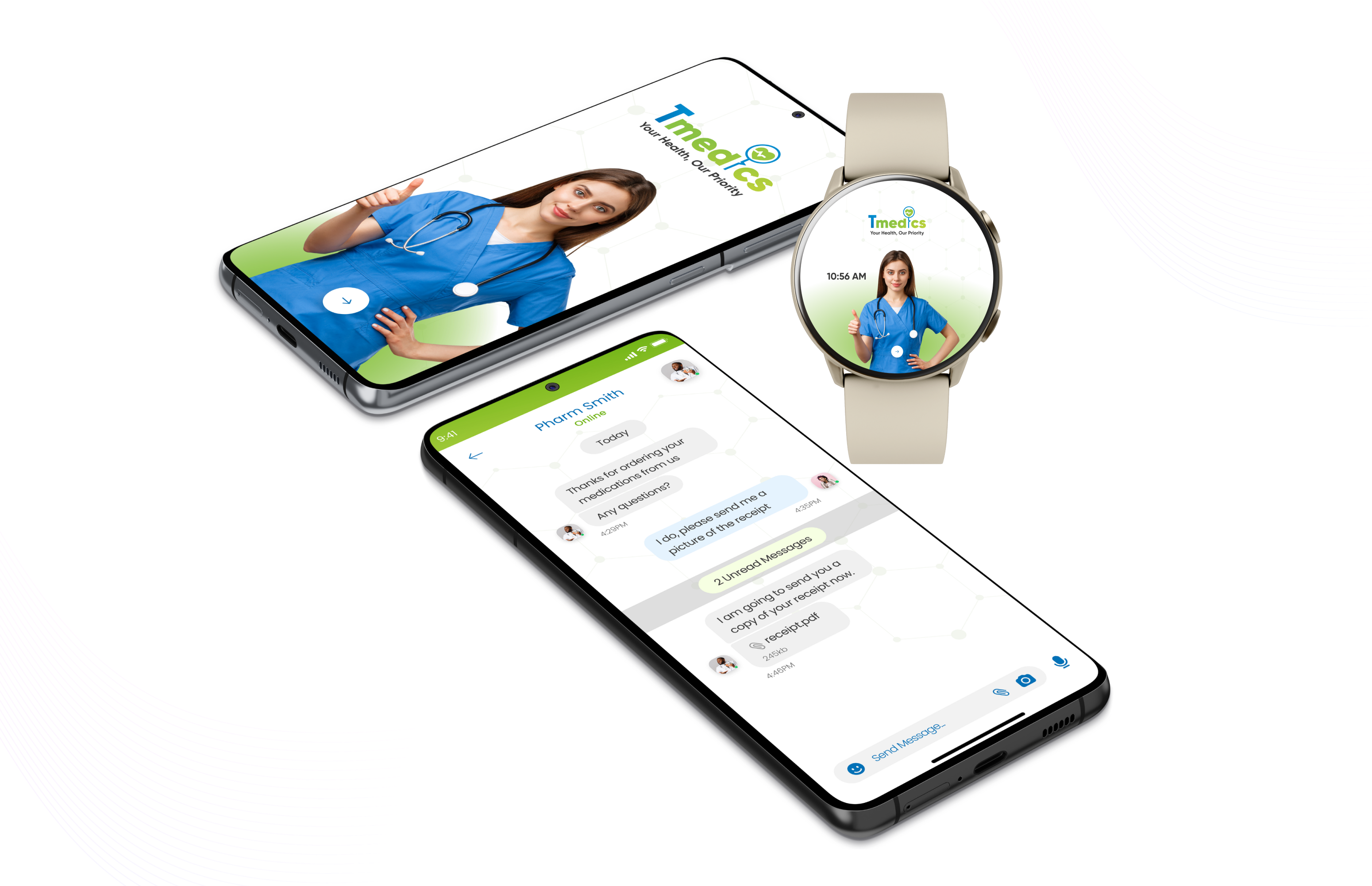
High fidelity prototypes were designed for IOS and Android devices, the goal was to make the end product easy, intuitive and work across multiple devices.
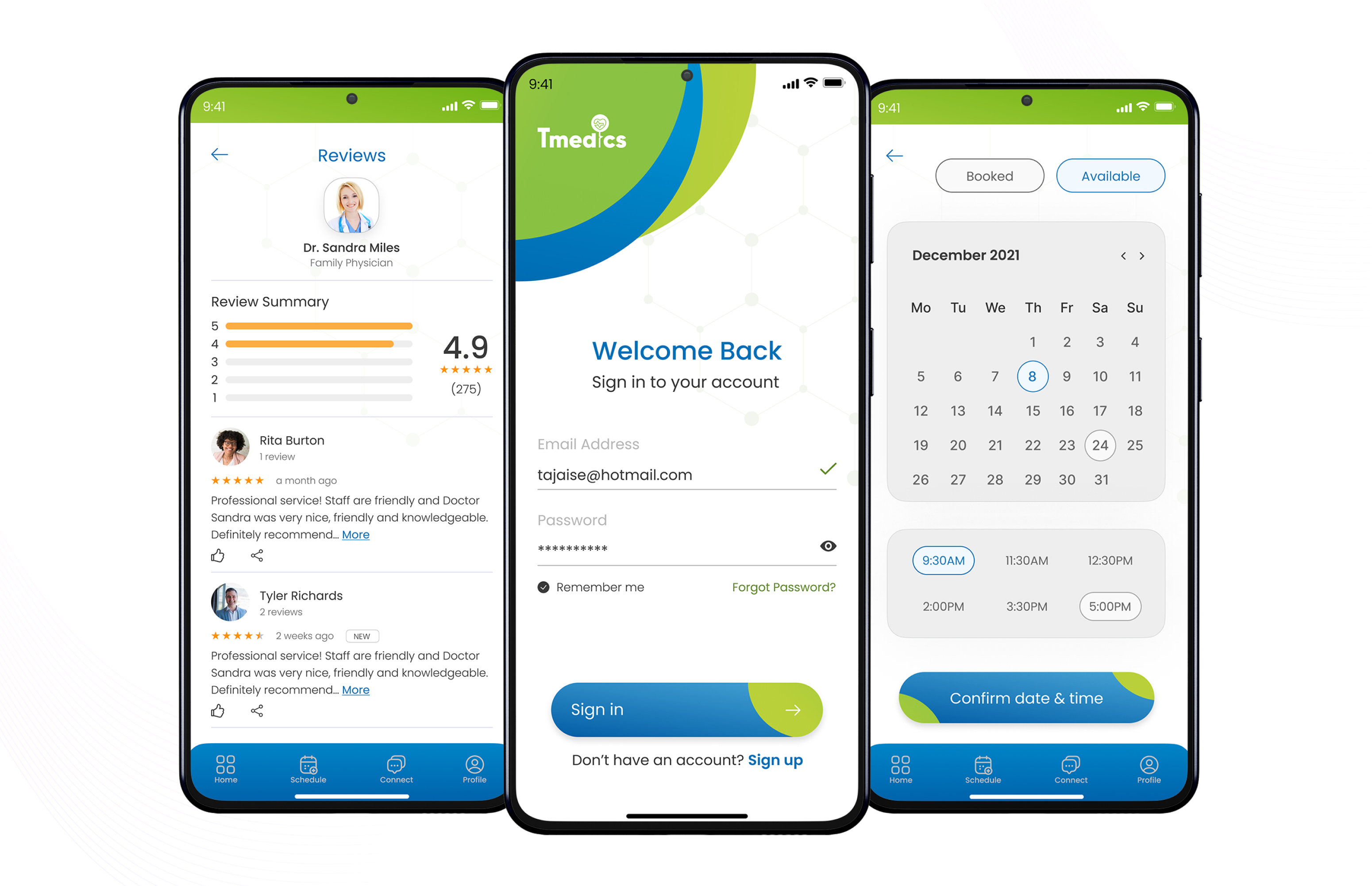
I conducted series of moderated usability testings with a good number of participants of different gender and race. My findings from the study revealed what needed to be modified in the prototype in order to give users a seamless experience. Testing sessions with users who represent the target audience. Unmoderated concept testing and A/B testing was also done.
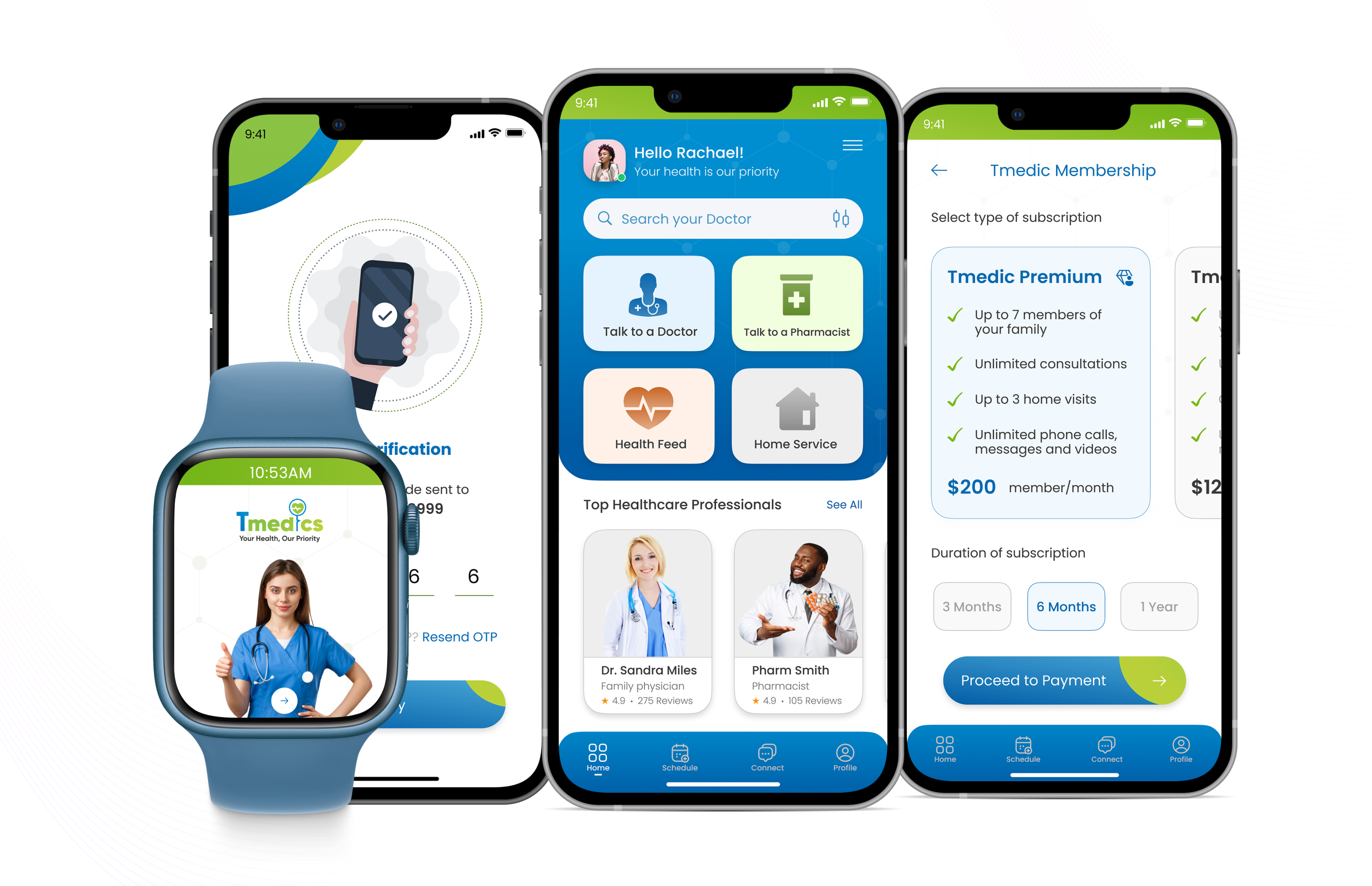
A couple of changes were made to the home screen for ease and simplicity after conducting an A/B test with the users. The sizes of all the major buttons were redesigned and a new customized button was created for the health feed. Majority of potential users preferred the new design as against the old design.
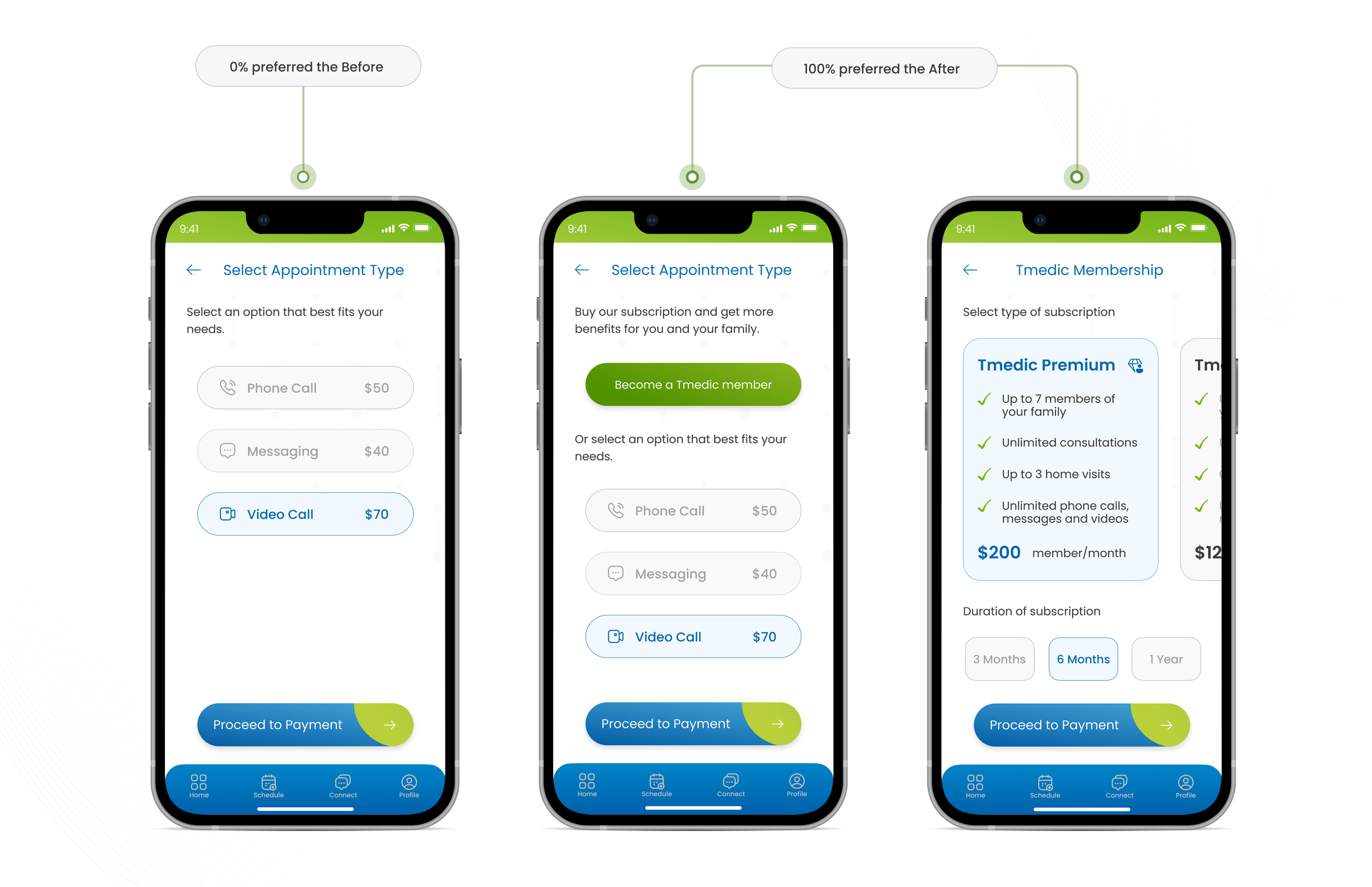
A couple of changes were made to the type of appointment to provide a more flexible plan for regular members. A Tmedic membership section was created to offer a more beneficial system to regular members. Two types of membership and three options for duration was created.
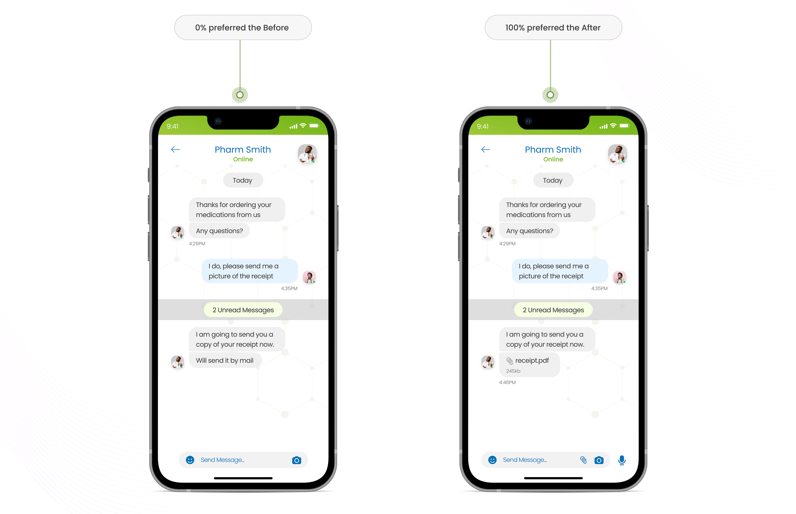
A couple of modifications were made to the message section. The initial design had no option for sending attachments as shown in the prototypes below, this was implemented. Another significant modification was the addition of a speech functionality that generates a voice message to get a better understanding of an explanation by the patients. This was a huge success as 100% of users embraced this option especially in terms of accessibility.
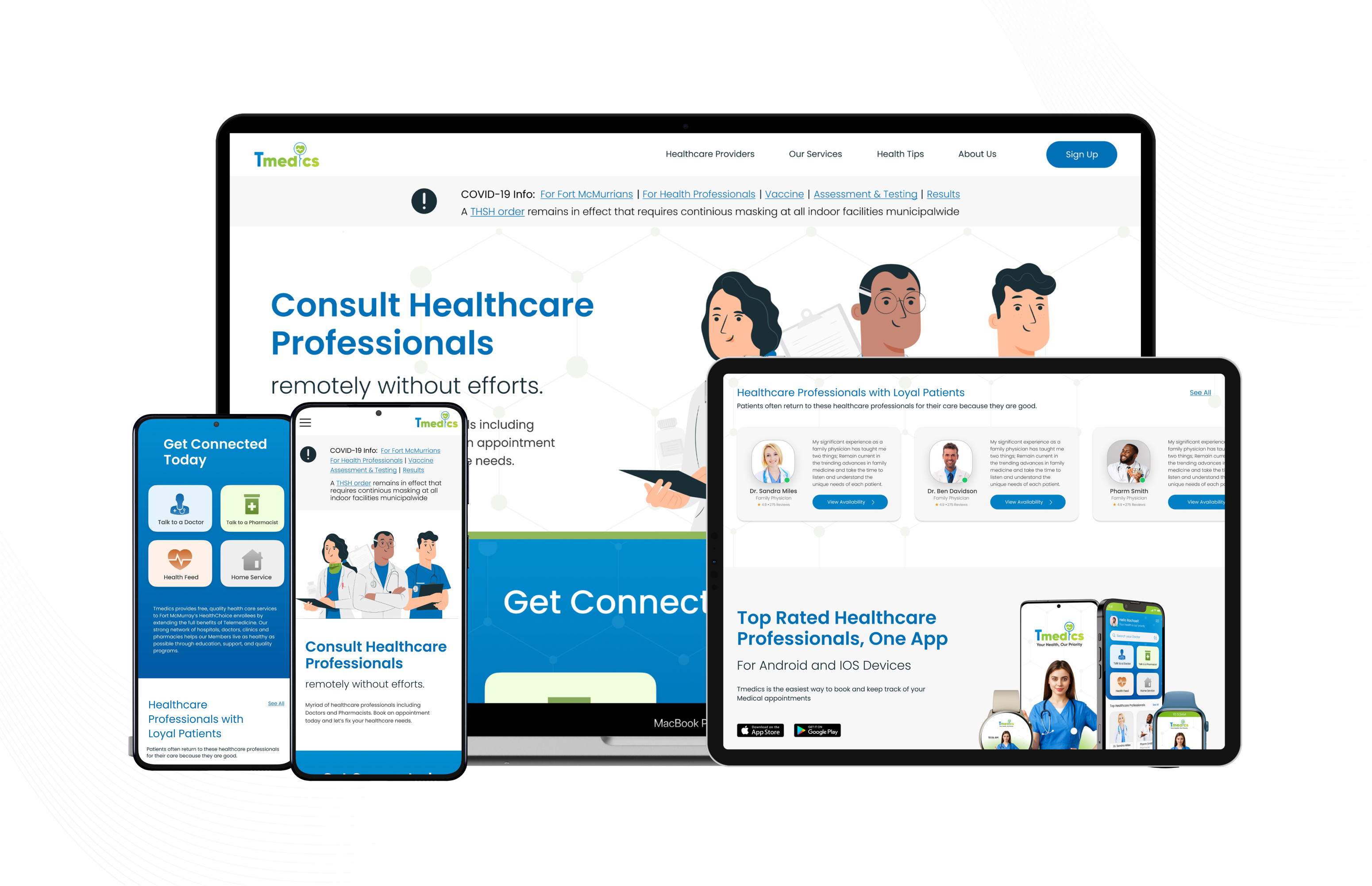
After concluding the designs for Tmedics app, I transitioned into the designs of the responsive website for Tmedics across multiple devices like desktop and laptops, tablets and mobile phones. The designs were based on inspirations from the mobile app to create a form of consistency across all platforms. The high fidelity mockups are shown below.
I live and breathe design
I have a growth mindset
I thrive in complexities
I'm a team player
Learn more about me and my story.